How did your career in publishing begin and what have been some of the highlights?
I experienced sort of a destiny Big Bang moment when I took over an internship at Entertainment Weekly about a year post-grad that a friend of mine from art school was leaving. I had a BFA in Illustration, but I might as well of had a degree in waitressing. I believe on my resume I mentioned I’d fetch coffee and rub backs if they would just hire me. I got the job. My boss was Robert Newman, an established magazine deity who was making EW one of the coolest new magazines on the block. The staff was loaded with some of the most talented designers in the business, all of whom went on to top creative director jobs. I’d hit the jackpot without knowing it.
Some highlights
Starting my career under Bob surely tops the list. First, as his intern at EW, and after, as a designer at New York Magazine when he moved there. The manner in which he communicates with his staff is deeply instructional about how human beings, under intense creative pressure, need to be treated to excel. He was, and is, a gem. True story: he remarked to me once while he was critiquing one of my layouts, “You need to stop doing that with your face.” Basically, he was pointing out that he could read all the anxiety and stress of my reaction in my expressions while he spoke. The takeaway that I use to this day is: if you’re good – and you know you are if I hired you – you’ll have more than one good idea. So, if the one you’re showing me isn’t working, it’s not personal. I’m not saying you suck. Just don’t be married to your ideas. Maintaining your composure while your design is basically being torn apart is what leads to good, cathartic, creative brainstorming – and ultimately, it just strengthens your chops.
- Being hired to be the Creative Director of Inc. Magazine when I was 32.
- Being fired as Creative Director of Inc. Magazine when I was 34 and becoming a brand new mother.
- Being hired 7 months later to be Creative Director of Women’s Health, a start-up. That leap of faith (on a product I had no sure way of knowing would succeed) paid off immeasurably for me: it gave full bloom to my voice as an art director. I shook off the feeling I had failed; with an extraordinarily close and connected team we made influential changes to the way women’s fitness magazines were designed, photographed, and read that still resonate today. Five years later, we won the ASME award for General Excellence. Special memory of EIC Michele Promaulayko giving me a shout-out from the ASME gala stage when I’d already left for PEOPLE. My partnership with Michele, and earlier with the founding EIC, Tina Johnson, fills me with pride and gratitude to this day.
- Joining the board of the Society of Publication Designers, becoming VP, co-hosting the annual Gala with my friend and colleague at Time Inc, Brandon Kavulla. Feeling a part of a tribe, really, for the first time.
- Being invited to Copenhagen and Oslo to be part of an International Design Conference, along with five other top level creative directors in magazines whom I’d long admired and then bonded with. Skol!
- My first week at PEOPLE. Compared to prior jobs, I felt like I was on the set of The West Wing, with all the walk-and-talks that go on here. At the time of this interview, I’ve designed approximately 210 covers in three years and covered every topic imaginable from whether Jennifer Aniston is solo on Thanksgiving, to the horrific and mind-numbing massacre of elementary school children in Connecticut.
How would you describe the design ethos of PEOPLE magazine?
I oversee numerous designers, production designers and iPad designers who are constantly designing under intense time pressure and high taste expectations. They come up with clever, creative, and sophisticated solutions in our layout designs – sometimes turning over an idea that just nails it in an hour or less. Our special features and packages stand up to any of the award-winning monthly publications. As for the photography, the picture editors here work with the top talent in the business. It’s a joy to work with the access and the ideas they bring to the table. As far as our branded “look,” I’d say we are modern, tasteful, playful when it calls for it, elegant when it calls for that. I especially love when the opportunity arises to push the envelope and do conceptual type work and image making.
Who are some of the most dynamic creative forces in the business?
This business is changing so very rapidly – therefore, it’s a fluid environment in which to be influential or a “force.” Many of us are branching into the digital space with fantastic acuity and confidence, and others are continuing to knock us out in print. And still others are breathing new life into print, with some of the most beautifully printed bespoke publications that I defy you not to envy for their unfettered creativity. Scott Dadich, who’s now EIC of Wired, was their Creative Director for years, and I love that he made what initially seemed an impossible leap seem so natural. More creatives will likely make the move to editors in the future. The old definition of Editor in Chief is changing rapidly; the old school formula for making it to the top is evolving. A good editor has worked both sides of the masthead and has a deep appreciation and skill in both arenas. That said, there are editors currently working today who aren’t necessarily former creatives, but certainly can be credited equally for being a “creative force” along with their art directors: Adam Moss at New York Magazine, Adam Rapoport at Bon Appetit, Deborah Needleman at the New York Times, to name a few.
Take us behind the scenes of a recent PEOPLE magazine shoot.
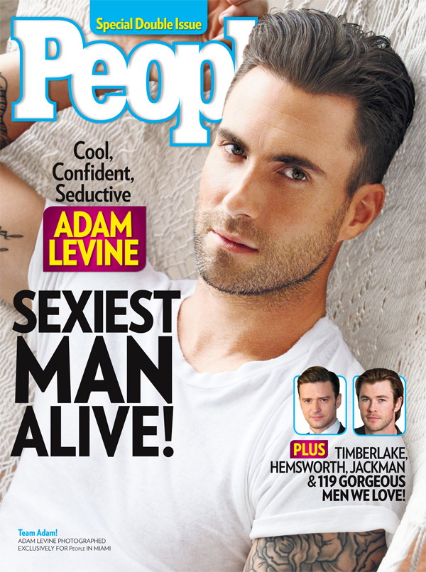
Our most recent Sexiest Man Alive photo shoot with Adam Levine. I didn’t tell my daughter – who’s a FAN – it was so top secret.

A crew consisting of photo editors, editors, journalists (who’d conduct the interview) and myself flew down to Miami where Adam was touring. We headed to a mansion on the bay where we met up with our fave photographer, Nino Munoz (who’s shot Gwyneth Paltrow’s World’s Most Beautiful cover and Channing Tatum for last year’s SMA) and his many assistants; also soon to arrive is the team: hairstylist, makeup artist, wardrobe stylist, set-prop stylists, boat operators, caterers, publicist, producer, production assistants, videographers, home owners, someone moving plants around, and a gecko.
The usual running around begins: In a smaller group we scout the property and drive around in the antique Chris Craft speed boat we rented mapping out locations, marking the weather patterns, discussing light as it’ll work through the day, negotiating and compromising with Adam’s crew about how much time we’ll have and how many outfits and setups we’ll need, and generally checking and re-checking the plan for the day a thousand times. It will include an interview with our journalists, and also a video interview that will run on PEOPLE.com. All systems go. Adam arrives and turns out to be a rather friendly, painfully handsome rock star with a flair for naughty jokes, singing the Beatles. He digs the clothes, vibes the set-ups, and hams it up for the photographer. The shoot goes remarkably smooth despite the threat of rain and the disappointing realization that he will never let us shoot him naked. We do strong-arm him into letting us shoot him shirtless so we can ogle his tattoos so long as it’s “tasteful.” We all look at the film, Adam seems to approve, we stagger around half wracked with fear we didn’t get it – and total confidence we did – then fly home to pass out. Cover does great on newsstands, and Adam plays ball on TV and social media and makes it worth the stress. Oh, and shout-out to the PEOPLE photo department, in particular Brenna Britton, who somehow produced this entire particular circus act and pulled it off beautifully and without crisis or calamity.
Design-wise, which publications do you admire?
There are plenty I flip through for ideas that are gorgeous, but lately I look for something to read where design isn’t actually getting in the way. Lately, those that are stellar editorially and also beautiful are (as always)New York, The New Yorker (midst of subtle and compelling redesign), Hollywood Reporter, and Time. Noteworthy new print pubs who’s aesthetic and voice dovetail perfectly with the rise in foodie and fashion culture that delight me personally are Gather, Kinfolk, Bullet, Howler, Gratuitous Type, Apartamento, Lucky Peach… on and on. They’re coffee-table magazines, but inspire in me renewed passion for the power of photography and clean design structure. The design teams of Bloomberg, ESPN, Women’s Health, Bon Appetit, GQ, and plenty more, are keeping the bar set very high for designers and photo editors.
What do young creatives looking to make their mark in publishing need to know?
Stay curious and don’t be afraid to take risks. That’s key. Every couple of years, you should at least poke your head up from your desk and ask yourself whether there’s something else out there you might like to try, another genre, another type of journalism. Whether that means you actually change jobs, or stay put, but bring a fresh approach to your problem solving, keep curious. Stay aware of what others are doing. Join SPD. You make a lot of contacts there and you find support when you need it, if you use those contacts to your advantage and you stay connected. I would encourage working on your diplomacy and articulation skills. If you’re good designer, you’ve got that down, but that’s about half of the game. The other half is knowing how to be persuasive with your collaborators and with your editor colleagues. I know many amazing designers who are quite shy, and often times, I see it hurt them when moving around in the business. Or at least, moving UP. Folks like to know what you THINK, so as long as your style is approachable and you make solving the problem at hand your focus, not just making your portfolio gorgeous. To gain more control over your career and your ideas, you have to have a voice and learn how to tune it to the room. To know to apply pressure when the room calls for it, and to know how to back off when it doesn’t. And that earlier lesson I shared about reacting to criticism… that’s huge. Because the whole game is getting along with people in positions of power and getting them to see they can trust your point of view and trust you to bring them an idea that succeeds. Your mark will be made, so long as you get to a place where you can actually make it.
What’s the best reaction you’ve had to your work?
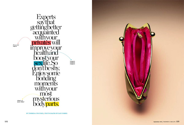
That they couldn’t get it out of their minds, the idea was so burned on their retinas. (see shot below). And whenever someone tells me a magazine looks better since I took over and messed with it. But really, as long as they’re not telling me I destroyed it, I am happy. The below photo was shot by Dan Forbes and designed by Shawna Kalish when I was at Women’s Health. It won a gold medal for design and for photography from SPD a couple of years ago.
How do you feel about the rise of the celebrity creative director?
I know many enormously well-recognized, successful and admired art directors who’ve influenced countless other designers, but I think you have to branch way beyond print to rise to the level of “celebrity” creative director. Certainly there are scads of those in fashion and advertising that really make being called a “Creative Director” sound verrrrry sexy. I know none of them.
Describe your most thrilling and fulfilling creative project so far.
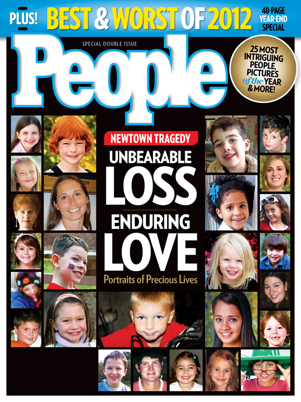
Probably the most fulfilling, if I am being honest, was the work me and my creative and editorial team did building Women’s Health from a six-time a year “test” magazine to an ASME award-winning publication. Thrilling are the moments here at PEOPLE when we kill a cover right before it ships, to push through a breaking story. Thrill sounds a dissonant chord with the example I’m showing here, but through our horror and sadness at this news, we were thrilled that we had the blessing of Martha Nelson (a guiding force behind this cover) to table our usual yearly franchise, The Best and Worst of 2012, to put these beautiful children on our cover in response to the nation’s shock.
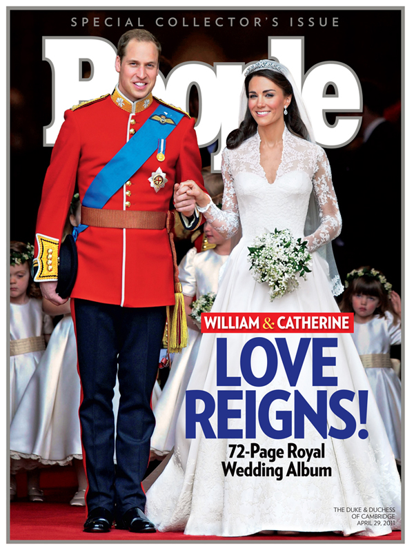
Another type of thrill when it comes to covers: When the opportunity to break free of the weekly formula for cover design arises and I can make covers that look like this –simple, direct, boom.
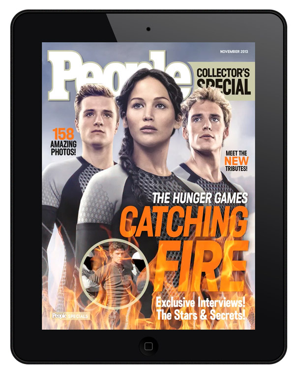
Lastly, the iPad team has been having fun with my covers, adding some fun bells and whistles as seen here with my Hunger Games special issue cover where they added flickering flames:
What have been some of the a) worst and b) most impressive student portfolios you have seen?
The worst are when you can tell the student is going through the motions, following whatever their Professional Practices teacher told them to do once they got out of school, as far as going around and showing their book. More often than not, the kid didn’t major in magazine design, just general Graphic Design, so their book is going to have a ton of varied projects completely unrelated to page design. But that’s not the problem, because if they’re good conceptual thinkers with skill and flair for type, I can see past the diversity and see potential. Problem arises when you ask them what magazines they admire and where they most imagine working, they often can’t name anything. Or they name a completely photo-driven fashion magazine. They’re sort of gobsmacked. I usually try to ask respectfully about every new thing I see in their book or on their iPad, and try and tease out their personality and ambition. But even an internship at PEOPLE or with me in general, you have to be way into magazines, and really tailor your book to the kind of design that will solicit interest. Make stuff up, create fake layouts and use your own photography, but make it look like you halfway know what you’re doing and prove it.
The most impressive books are really well thought out. You can see their point of view and their process leap right off the page/screen. They’re informed about the person they’re showing their book to, they’ve read the magazine whose offices they’re sitting in; they’ve gone above and beyond to produce little magazines themselves or made really creative spreads with their own illustrations or photos, and they take it farther and with greater attention to detail than their peers. Those books not only impress me, they make me jealous, and want them on my team pronto.
Which photographer(s) or illustrator(s) work best captures the essence of PEOPLE magazine?
PEOPLE covers a huge span of content, so I’ll list a bunch: Nigel Parry, Robert Maxwell, Frank Ockenfels, all of whom capture in their portraiture a noble dignity and solemnity that honors their subjects; Art Strieber, who does beautiful group portraits and reportage; Martin Schoeller for his narrative concepts and environmental portraits, Ruven Afanador, who raises everything to Art; Ron Haviv, our man in places like Haiti where his journalism stuns us – he and Ben Lowy – he’s fantastic too for the hard hit far flung places and events; Brian Doben and Jeff Lipsky who do a ton of covers for us and always bring back something solid and strong – Andrew MacPherson too, for same reason; Nino Munoz for his beautiful special celeb covers; and Emily Shur who’s a great go-to for humor in her portraiture. There are MANY more enormously talented photographers we work with, but those are probably the go-to list.


