How did you get into magazine publishing and when you reflect back on your career what have been some of the highlights?
I graduated from Parsons School of Design with plans to never, ever go into magazines. I’d always loved reading them, admiring them, collecting them, and being inspired by them, but I just wasn’t that into my magazine design courses in school. I was on more of a trajectory to work in a design firm. So naturally, my first job opportunity came from Interview magazine (yes, Andy Warhol‘s Interview magazine, so magazine or not, this Factory-obsessed kid was doing this). The magazine itself was right up my alley, but I was green and in over my head. At the time, I had no idea what a unique and creative opportunity it was, and I was overwhelmed by the whole experience. But looking back, I learned so much from my triumphs and missteps there.
Career Highlights
• My interests are diverse, and I’m proud to have had a hand in creating some of the coolest titles in the world, including Interview, Sports Illustrated, and Discover. I even worked for the American Kennel Club on its monthly publication, the AKC Gazette (which is where I met my wife, Dina). I was Senior Art Director of Rolling Stone, Design Director of Spin, Design Director of Runner’s World, and I’m currently Design Director of Entertainment Weekly (which I’ve been reading since day one).
• After only a year and a half at EW, I’ve designed 100 covers (we do a lot of split runs)!
• Creating “The 100 All-Time Greatest Issue” at Entertainment Weekly. It is 80-plus pages of the top 100 greatest movies, TV shows, albums, books, and plays ever, including a tribute to the late James Gandolfini. We commissioned 20 original (and ultimately award-winning) works from a curation of incredibly talented artists including Philip Burke, Gerard Dubois, Eddie Guy, Jody Hewgill, and Mark Ulriksen. The collection of illustrations is astonishing, and I’m very proud that it was accomplished for a weekly magazine. To balance out the package we ran some very interesting behind-the-scenes and candid photographs throughout. This, along with a super tight (and for the most part, civil) collaboration with the editors, made this one of my favorite issues ever.
• Going on the sets of two of my favorite shows, The Walking Dead and Sons of Anarchy, to help direct EW cover shoots. It was amazing to walk through the prison where the Walking Dead crew would be taking up residence, and it felt dangerous to sit on Jax Teller’s motorcycle for a quick lighting-test portrait, but as an Art Director, it was most interesting to see the amount of detail and design that goes into the sets. It was exciting to reside in those worlds for a few hours, but even more exciting to get back to my computer and work with the images we created as fan-favorite covers!
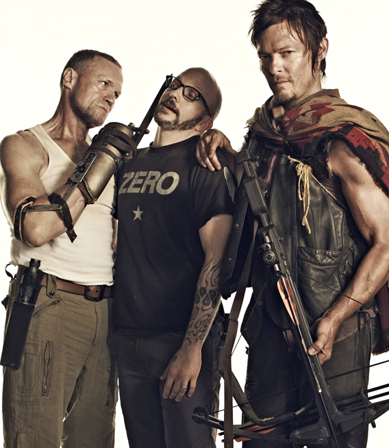
Photograph by Frank Ockenfels 3
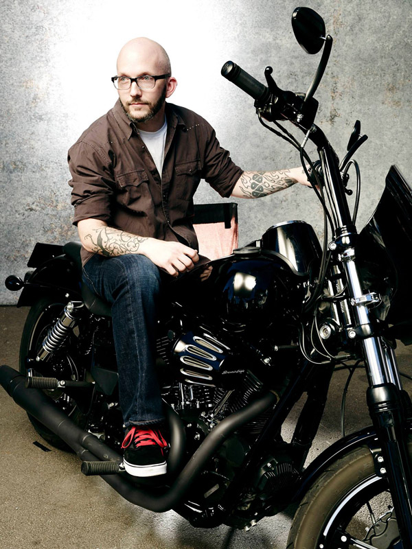
Photograph by Art Streiber
• On a more personal note, the legendary Dave Grohl (Nirvana drummer and Foo Fighters frontman) signed a Polaroid from our Spin cover shoot along with the inscription “It’s a Boy!!!” for my son Walker’s birth announcement. It doesn’t get much cooler than that!
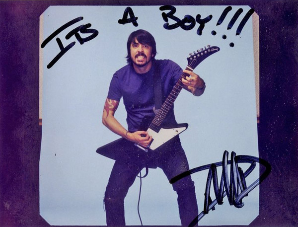
Photograph by Matthias Clamer
How would you describe the design ethos of Entertainment Week?
Basically the design needs to work editorially, so no design for design’s sake. Every choice should have a reason (even if sometimes the reason is “It just feels right”). I approach each page as the reader, so I look at everything “fresh,” without preconceptions, as if I just cracked open the issue for the first time.
We’re a weekly magazine that acts like a monthly (albeit a skinny monthly), so while the magazine is formatted, there is room to play from issue to issue, page to page. Feature design is always an ambitious endeavor with lots of experimenting and options, and I strive to capture the vibe of the subject in a unique treatment each time (all while staying within the EW vernacular, of course). The design and architecture are clean, bright, flexible, and accessible, and we’re not afraid to have fun with typography or solve problems with illustration.
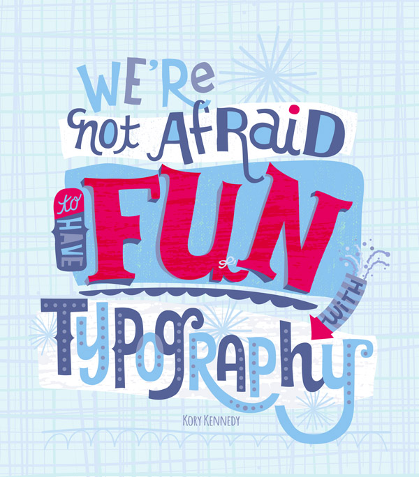
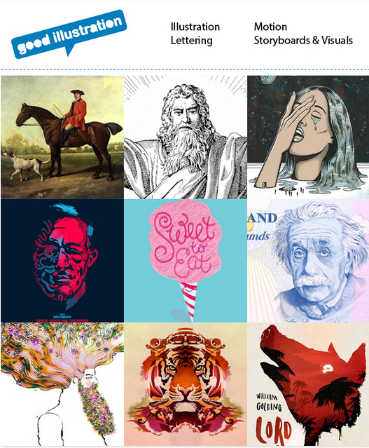
Lettering by Jill Howarth, represented by Good Illustration
I look at EW as not only reporting on entertainment but making entertainment. We’ve earned our place in the pop culture world and our readers hold us in high regard, so it’s my goal to keep trying new things and keep it exciting without putting anyone off. We need to keep selling tickets.
What does your role as Design Director broadly entail and how is your team structured?
I oversee the EW design team and am responsible for the visual look of the brand across all platforms. This includes page layout, typography, and illustration. I do not oversee the photo direction, but I work closely with the photo team throughout the weekly process. I design the covers each week and work closely with our editor on cover lines and overall look. We have a very talented team of 10 unflagging designers, and the book is divided amongst them with the more senior art directors working on big special packages and feature stories. We have a small team dedicated to translating each issue for our tablet edition as well.
What’s the most creative idea you’ve had for a shoot?
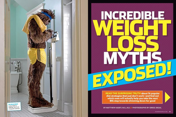
The idea that sticks out as most creative is a service story I needed to visualize for Runner’s World. We needed to art a story called “Incredible Weight Loss Myths Exposed,” which included long-accepted diet strategies like “Mini-meals are better than three hearty ones” and “Lift less weight with more reps to get toned.” A lot of these service stories can be pretty straight-forward, but I was able to pick up this myth idea and run with it. My concept was to use a mythical creature (in this case, Bigfoot—because who else represented running better than a big hairy creature with huge feet?) as a model, deck him out in running gear, and have him act out the list of myths. I immediately got on the phone with photographer Gregg Segal and we brainstormed a ton of ideas that resulted in a really fun and ambitious feature story with something like 10 different setups for the piece.
Tell us about some of the most talented photographers and illustrators you’ve had the pleasure of working with.
I’ve worked with a lot of very talented photographers and illustrators over the years. I recently had the pleasure of working with photographer Art Streiber on the set of Sons of Anarchy for an EW cover shoot. SOA is one of favorite shows, so I was very keen on attending this shoot and creating something cool. Art was very collaborative and made great decisions on the fly. He managed the talent really well and was technically on the money. Beautiful shots. A moment that stuck with me, oddly, was watching him adjust the Grosh backdrop for us so that it hung just right. Something about seeing him in his crisp, white button-down shirt balanced up on a 10-foot ladder endeared him to me even more. I’ve also had lovely times creating images with Chris Crisman, Michael Lavine, Frank Ockenfels, Gregg Segal, and Justin Stephens, to name a few.
I’m a huge believer that illustration is very useful in magazine making (and a big part of my sensibility), so I’ve made it a point to give it big play in my magazines wherever it makes sense. Creating a unique piece of artwork that works with the story is challenging yet so much fun. Philip Burke blew my mind with his painting of Walter White and Jesse Pinkman from Breaking Bad for a short feature story (and he was kind enough to loan it to the EW office, where it still hangs today). A random selection of artists I love working with: Marcos Chin, Johanna Goodman, Eddie Guy, Jody Hewgill, Kagan McLeod, Edel Rodriguez, Yuko Shimizu, Mark Stutzman, Gary Taxali, Jacob Thomas, Mark Todd, Mark Ulriksen, and on and on…the list has no end. Oh, and Edward Kinsella painted an amazing portrait of David Bowie (for our “Top 10 of 2013” issue) that now hangs in my living room!
What fires up your creative juices?
Great storytelling, coffee, Queens of the Stone Age, pop art, the city, collaboration, David Bowie’s The Next Day, Razzles, and headlines that make sense.
Who do you most admire in the magazine industry?
All the smart people I’ve worked with over the years. I have great respect for Steve Hoffman, who hired me at Sports Illustrated and was always a big backer of mine. Rockwell Harwood, who I worked under at Discover for about six months. From him I learned how to approach problems with the editorial in mind and to tirelessly keep trying options and variations until it’s right—“You’ll figure it out.” Andy Cowles is the man who hired me to be his No. 2 at Rolling Stone, and, he’s a good friend. He showed me a completely different way of looking at things (the U.K. way of packaging and storytelling) and taught me to find a true reason for my decisions and to boil down a page and make everything on it “work hard.” There’s an honesty and functionality to his work that I hope comes through in my own. And Bob Newman, who I never worked with but is a class act. When Bob was the Design Director of Details magazine (some 15 years ago?), I sent my portfolio to his office without prompting. I returned to my apartment that evening to find my phone ringing, and Bob was on the other end. He didn’t give me a job, but he did take the time to chat with me for about 10 minutes, and I’ll always be touched by that kindness.
Which 3 projects from your portfolio of work would you select to share with our audience?
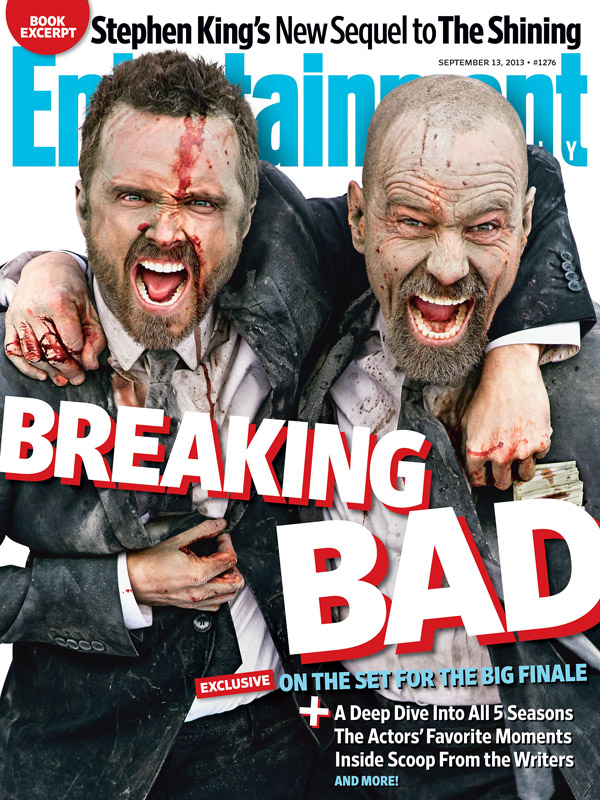
The Breaking Bad cover:
We got to shoot two of the greatest actors, playing two of the greatest characters, from possibly the greatest show ever for our cover. The shoot took place in New Mexico right as they were finishing up shooting the final season, and the boys were in a celebratory mood and up for anything. It’s not often that big stars would want to get dirty and bloody for a cover, but they did just that. I got a little raucous with the typography and matched the logo color to that of Walter White’s famous blue meth.
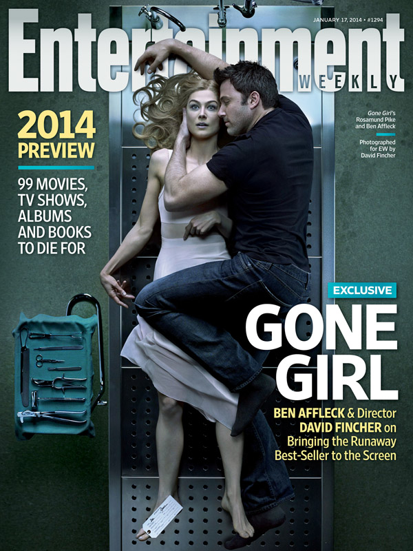
The Gone Girl cover:
Director David Fincher pitched and shot this cover exclusively for Entertainment Weekly.
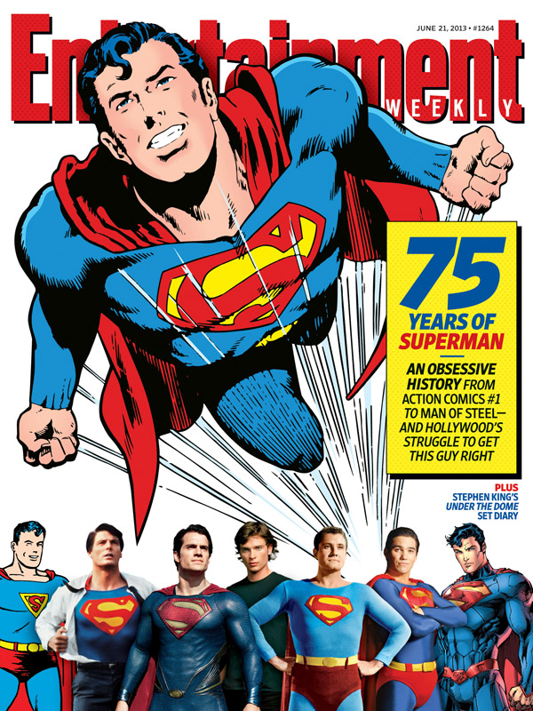
The “75 Years of Superman” cover:
I’m a big fan of this cover (a) because of its simplicity, (b) because of its poppy colors, and (c) because I love Superman. This was something we put together quickly and without a lot of resources (all of the art was pickup), but knowing a little something about Kal-El, I had a blast sifting through the images of him through his 75-year existence. I integrated my own Ben-Day dot pattern into the Superman red logo and the yellow text box for an additional nod to comics.
Which industry creatives have you had the most interesting conversations with lately?
A group of Creative Directors from a variety of Time Inc. titles got together for dinner over the holidays and we compared notes, shared gripes, and drank a lot of wine. We talked about day-to-day happenings at our titles, the future of tablets, print merging with digital, and the looming spin-off of Time Inc. into its own entity. I can’t really give away what we have in store for the upcoming year, but I can say that I feel lucky that I wasn’t asked to pick up the tab!