

Tell us a little about how you got into children’s publishing and what your current role, Associate Art Director for Simon & Schuster, broadly entails.
I interned at Simon & Schuster Children’s Design division the summer following my junior year of college. When I graduated the following spring there was a Junior Designer position available and I got the job. My current position, Associate Art Director for Simon Pulse and Aladdin, involves conceptualizing and designing jackets primarily for tween chapter books and teen novels. I art direct illustrators and photographers, organize photoshoots and design the final jacket and/or cover layouts.
As you work across picture books, tween chapter books and teen novels, can you describe the rewards and challenges associated with art directing these different categories?
With novels, you have one piece of real-estate to visually describe the story. It is hard to condense a 320+ page novel into one image that sends the right message for the book. It has to be something that grabs the readers attention quickly, without giving away the entire story/ending. With picture books, I find the challenge is to create a new, fresh image that represents the interior art and story, but isn’t repetitive of what is to come in the interior.
How is the art department at Simon & Schuster Children’s Publishing Division structured?
There are a number of imprints. Beach Lane, Atheneum, McElderry, S&SBFYR and Paula Wiseman all publish novels and picture books. Little Simon primarily publishes board and novelty books, as well as some early chapter books. Simon Spotlight publishes books for licensed properties, while Aladdin publishes a small amount of picture books and primarily middle grade novels. Simon Pulse publishes only teen novels.
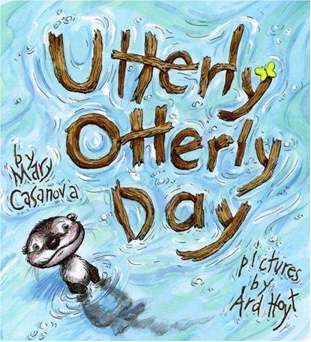
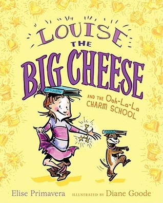
You have been responsible for some fantastic cover designs including Merits of Mischief, Fourth Grade Fairy series, Nerd Camp, My Mom is Trying to Ruin my Life, Ballerina Rosie, Louise the Big Cheese, Utterly Otterly Day, and Utterly Otterly Night. Can you select a couple of these titles and explain how the cover concept evolved?


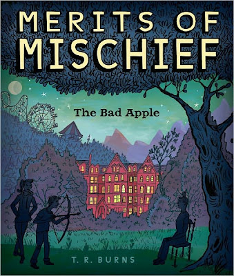
Merits of Mischief is one of my most recent projects from the above list. The book starts with a good kid who accidentally kills his substitute teacher with an apple during a cafeteria food fight, and then is sent off to what he thinks is reform school, but is actually a school to mold future troublemakers. We started by hiring Gilbert Ford to illustrate the jacket. He submitted a number of sketches and we originally went pretty far with a different concept. It featured the legs of the teacher and the “bad” apple lying next to her on the floor in a fun style to show the wackiness of the set-up. We pushed this pretty far with the series name Troublemakers. But as we worked on it further the Editor, Liesa Abrams, and I felt that Troublemakers didn’t seem like a unique enough series name. So after a big brain-storming session with marketing, the entire editorial department and the author the series name was changed toMerits of Mischief. We looped our salesteam in with the cover sketch that editorial and design loved and sales felt strongly that the dead teacher wasn’t arresting enough, nor was it kid-friendly enough, and that the bad apple implied that the teacher ate the apple and died, which of course if you’ve read the book, you know is the wrong message. So we decided to go back to the drawing board and spread out all of the artist’s original sketches. Liesa and I picked our favorite things from each one and then went back to him and asked him to combine these aspects to create the current packaging.
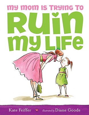
For My Mom is Trying to Ruin My Life the editor, Paula Wiseman, and the illustrator, Diane Goode, and I knew that the cover had to walk a fine line of being funny, yet not offensive to moms. And with such a funny and powerful title, we knew we really wanted to emphasize it on the cover. We came up with the cover idea from a piece of interior art Diane had already created, to feature the mom kissing the little girl and for the little girl to look unhappy and embarrassed or disgusted. Diane was able to get the expression perfectly. We felt that this would make readers chuckle as moms could probably relate to the mom on the cover and once upon a time being the little girl on the cover too. It seemed funny that the “bad” thing the mom was doing was giving her daughter a kiss; too much love. I tried a lot of various fonts and ways to play up the title. At the beginning “My Mom” was more emphasized in the title design, but we realized pretty quickly that the most important word should be “Ruin” and I added the little heart over the “I” to show the humor of ruining her life with love and care.
Simon & Schuster publishes approximately 2000 titles annually. How many children’s titles do you personally oversee per year?
I usually work on roughly 15-20 titles a season and we publish 3 seasons a year.
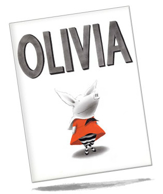
Bestsellers from Simon & Schuster’s Children’s Publishing Division include The Dork Diaries by Rachel Renee Russell, The Clockwork Angel by Cassandra Clare, Thirst by Christopher Pike, Olivia Goes to Venice by Ian Falconer, and Hush, Hush by Becca Fitzpatrick. What would be your ‘ones to watch’ for the 2012/2013 bestseller charts and why?
I would be sure to watch for 33 Minutes, a new middle-grade novel by Todd Hasak-Lowy. I’ve read the story and am working on the cover now. The author has nailed the voice of a 12 year old boy perfectly and I think every middle school kid can relate the main character. The story is insanely funny, poignant and touching. It follows the universal story of the ups and downs of friendship. It is a fantastic read.
I would also be sure to keep my eyes peeled for Crash, the first book in Lisa McMann’s new series, Visions. It is a real page turner and reminiscent in all the best ways of her first book, Wake.
What area(s) is Simon & Schuster’s Children’s Publishing Division looking to build on moving forwards?
I think like all publishers we are considering the digital market. E-readers are growing incredibly popular. I think it is a really exciting time to be in publishing, as these readers and Ipads are offering lots of new possible ways to consider books.
Who is your favourite illustrated character from a children’s book and why?
I love Olivia. She has spunk, heart and humor. I think she is a character that people of all ages can love—she has a timeless feel.
When working with a new illustrator, what 3 personal qualities are most important to you?
Someone who is really creative, willing to collaborate and is enthusiastic.
What elements should an illustrator include in their portfolio to attract your attention and what should they avoid?
I think they should share their best work. As long as their work is good, I’ll be attracted to their portfolio. Also, showing that you can illustrate girls and boys of all ages is always helpful. And that you can create the same character in various positions, poses, and expressions is always encouraging.
This interview has been syndicated courtesy of Childrensillustrators.com