

Tell us about your background including what some of the key highlights have been
I graduated from the University of Central Lancashire in Preston with an honours degree in Graphic Design in 1989. The course was a 4 year sandwich course and, as part of the course, I spent 6 months working in the Manchester office of a corporate/packaging design company called Bowes Darby which was definitely a key moment in my design education. I think everyone on the course came back more rounded and understanding of the industry we, at the time, (still!) dreamed of entering.
Unfortunately leaving college in the late 80s was a terrible time, economically. I was taken on by 3 London design agencies with jobs lasting only a matter of months before each succumbed to the recession. My big break in publishing was fortuitous, but accidental, with The Senate (run by ex Penguin stars David Eldridge and Stuart Brill), in 1990. Initially on a week’s freelance as a junior, I ended up fully employed for over two years working on covers from companies including Granta, Virago, and Hutchinson (and also Labour Party campaigns and conference sets leading up to the 1992 General Election defeat). It was a great opportunity and my love of the possibilities of book cover design began. After that I worked for Head Design on the Headline list for two years. Critically, the chance to experience, at close quarters, the working methods of David Eldridge on more literary titles and the commerciality of David Grogan, at Head, on ultra commercial titles has stayed with me to this day and was an amazing ‘apprenticeship’ which, hopefully, I’ve used wisely?! Later, after 7 years at Pan Macmillan (latterly as Associate Art Director) I followed former colleague (at Pan Mac) Vintage/Random House Creative Director Suzanne Dean to Random House to head up the Cornerstone Design team where I have been since 2002.
Your role involves coordinating a team of designers. Tell us about the challenges associated with managing other ‘creatives’.
I am ultimately responsible for the entire cover design output for Cornerstone so to make the most of the team’s individual talents is key. Our list is pretty large and broad, including fiction and non-fiction, commercial and more literary. Each designer has strengths, and weaknesses, however a list can never be as broad as to delineate simply along the current lines of these strengths amongst the team so the main challenge is to balance the ‘easy route’ of briefing to an individual’s strength while still assigning briefs out of their comfort zone. I do feel it is important not to give up on perceived weaknesses but to work at them, both for the sake of the team and for the future of the individual’s career.
Redesigning existing titles are an important part of your role as Art Director. Talk us through the process of breathing new life into these jackets, what is your unique approach?
It’s hard to say as each redesign has it’s own challenges and requirements but, as a designer, the main thing we can offer is our interpretation of a book, so I think it’s very important to read the books to be able to distill your own vision rather than simply taking briefs at face value and supplying exactly what is asked for or expected.
How can an Art Director stay ahead of the curve when it comes to emerging design trends?
I think you need to keep up with as many areas of design and entertainment aesthetics as possible. Whether it is in video gaming or magazine design, film posters or product packaging etc.
Were you encouraged to be creative from an young age?
My father was a printer by trade and began his working life as a hot metal type compositor on the Northumberland Gazette in Alnwick, in the North East of England. At home he had shelves of type books and, even as young as 4 years old, I remember I would sit for hours making up words by tracing letters from these manuals onto grease proof paper. Later, at my comprehensive school I had a brilliant Art teacher, Mr. Harry Ridley. I gained an ‘A’ at O level so his expectation was that I would take that forward to A level. However the way the schedules worked, it seemed that the clash of subjects meant that Art was not going to be possible with my other, more ‘sensible’, choices of Maths and Geography. Horrified with this, Harry gave up his free periods for two years to teach me so I could continue. To this day, I feel his intervention was probably the pivotal moment in my creative career! Without his encouragement, design would have been beyond reach.
Visually-speaking, which books do you vividly remember from your childhood?
Apart from the type books! As boy I had a whole heap of Ladybird history books. They were little A format hardback books illustrated by John Kenney. These books felt very special because of the quality of the painterly style and the PLC covers. I think I appreciated the visuals more than the contents (!) and I still have them for my kids and, looking at them now, I still can feel the fascination I had with them as a child and the importance of the book as a whole, appealing package. And now, they are fabulously retro!
I also remember my mother’s copies of early front list Wilbur Smith books, bought from her book club, particularly A Sparrow Falls. Of which I had the pleasure of working on when I designed/redesigned Wilbur Smith covers at Pan Macmillan!
Which 3 projects from your portfolio of work have given you the greatest thrill to work on, and why?
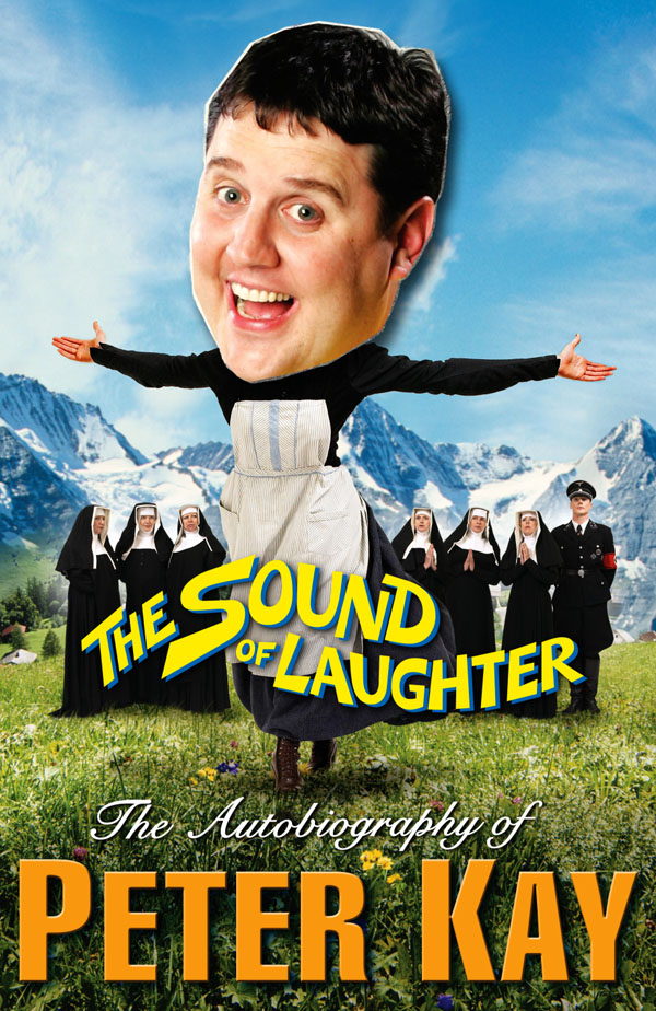
Peter Kay autobiography. The Sound of Laughter. This was real collaborative project direct with Peter which was a great experience and great fun. We talked through his concept, which I was tasked with making work visually. A comedic homage to the original Sound of Music poster. It was quite a departure for autobiographies at the time, but SO Peter Kay. We obviously couldn’t use any of the original film poster material so I worked with the photographer Colin Thomas to recreate a version of it that could work as a book cover. It was a lengthy process casting nuns, Nazis and a dancing Maria which were all shot and montaged against stock shots of the ‘hills’ as well as commissioning a lettering artist for the title type. It became the best selling autobiography since records began, not least because of Peter’s popularity, but I feel the impact of the cover played its part.
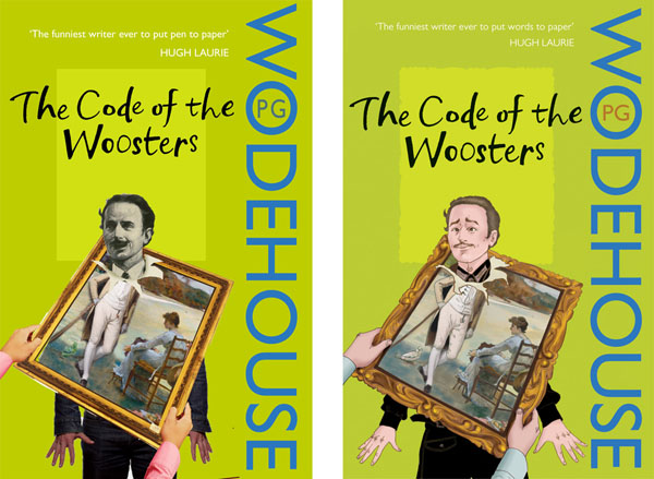
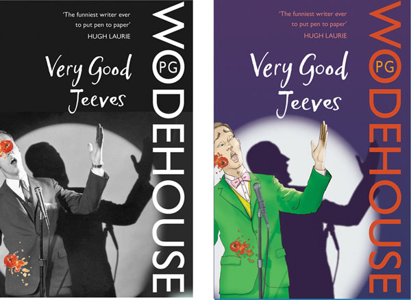
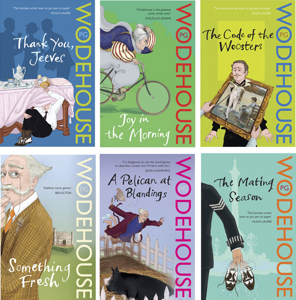
P.G. Wodehouse backlist. This was a fabulous opportunity to work on one of the most iconic authors of all time. Initially I had to present concepts to, not only the in house team, but also the Wodehouse Estate. They were gratifyingly supportive and the look pretty much went through as intended. The Wodehouse name running vertically was the most radical element though the choice of illustrator, a Korean illustrator living in Seoul (called Swan Park) was quite ‘controversial’ for this quintessentially English author. We needed to redesign 44 titles in 6 months! I ended up reading, creating the concepts and commissioning 2 covers per week til they were all finalised. Because of this, I had to create fairly detailed layouts for each book from which Swan interpreted in her trademark style.
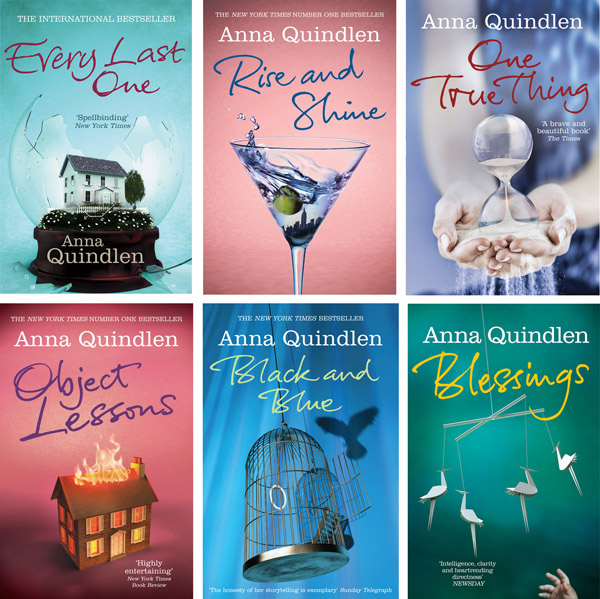
Anna Quindlen. This was a project to design the new front list paperback and the backlist to match. I read each book to come up with symbolic objects that illustrate the narrative of the book. They were briefed as commercial but aspirational (in a reading pitch sense). The kind of book that could sell equally in supermarkets and Waterstones. I again worked with Colin Thomas, this time using a mixture of commissioned photography, stock imagery and a lot of CGI/photoshop as well as commissioned calligraphy by Stephen Raw.
What are some of the creative constraints associated with commercial jacket design?
The parameters of the most specifically commercial genres create restrictions, in themselves, that can be quite daunting. Add to that the opinions/input of Publisher, Editor, Sales, Marketing (all in house), and the author, plus booksellers/supermarkets, then the whole process can seem pretty overly restrictive. I feel that, as a commercial book cover designer (of which I am, unashamedly!) you need to embrace them. Graphic designers are problem solvers, not fine artists, so need to work within the restrictions whilst enjoying more freedom when it becomes apparent. Happily, Cornerstone’s list is broad enough to encompass a range from Sebastian Faulks to Katie Price in fiction and a similarly mixed spread of literary to commercial content in non fiction so, as a designer, there are plenty opportunities to flex design muscles through differing aesthetic requirements.
What are the most a) inspired and b) most flawed examples of book cover design you have seen recently?
I’m not sure it is flawed but the ultra commercial end of the market cannibalises covers so quickly (Look at the fluorescent type following the success of ‘Gone Girl’). I think it is because these covers are an integral part of the marketing campaign and, like movie posters or computer game covers there’s a bit of a need for ‘it does what it says on the tin’ signposting. (If you like that huge seller, you’ll like this one). Often it’s a process that’s not great for the designer but can create interesting design challenges that can be rewarding nonetheless.
On the positive side I have been pretty impressed with Orion’s recent design developments with authors like Michael Connolly, Denise Mina and particularly Ian Rankin in crime/thriller pushing back against the commercial gloss. Their covers certainly are attempting to buck the trend, I think.
Share some if the best pieces of advice you have been given during you career?
I feel I have actually garnered my best ‘advice’ not through words but by witnessing at first hand the methods of designers that I have worked with and have mentored me in the past (as highlighted above). However, even recently I feel I have learnt and improved through watching new designers’ working methods, thought processes and influences.