
Describe your professional journey explaining how you arrived at your current position, Senior Designer at Macmillan Children’s Books.
The two areas of design I have always been interested are children’s books and music. I studied Visual Communication at the University of Technology, Sydney, and majored in Illustration. After finishing uni I came over to London with the intention of working in pubs and traveling Europe- then returning back to Australia. But somehow this didn’t happen. I had the good fortune of landing myself the role of Designer at Egmont Children’s Books where I worked on a wide range of titles. These included learning books, fiction covers and Banana books,and licensed characters such as Winnie the Pooh and Thomas the Tank Engine.
After a year at Egmont, I was offered a job at design studio Stylorouge. The studio was responsible for many brilliant, iconic designs – including the Trainspotting poster, and album covers for the likes of Blur, Rolling Stones and David Bowie. It was quite a departure from Thomas the Tank Engine but I was eager to do more illustration and push the design boundaries a bit more. I worked at Stylorouge for 6 years where I worked with some amazing musicians – Crowded House, The Cooper Temple Clause and Blur, and a range of other clients including Henry Holland & Cancer Research.
After the digitalization of the music industry, budgets started shrinking and things got tougher so I felt it was time to get out. I felt it was time to return to my other love, and get back into children’s books. It was a stroke of good luck that a job came up at Macmillan at this time, and being such a fan of their lists, I eagerly joined up.
And I haven’t quite made the move back to Australia.
How is the art department at Macmillan Children’s Books structured?
The art department is quite small. We all sit together, which makes it nice for sharing ideas, illustrators that we’ve discovered, or getting each other’s opinions on our latest designs. There’s 3 designers (lovely ladies Jo Spooner & Emma Farrarons, and myself) plus Chris Inns, our fabulous art director. Chris gives us a lot of freedom in our roles, and we’re all free and open to come up with new ideas, and suggest new talent to work with. For each different project, there’s a pairing of one designer to one editor, and it’s ideal to mix these pairings up so we all get to work with each other.
What key advice would you offer illustrators looking to attract the attention of Macmillan Children’s Books?
As an illustrator, It’s really important to know your craft. Spend the time and dedicate yourself to learning your medium(s) and really experimenting, pushing boundaries.
Be good at what you do. We love to see new fresh illustrators who have their own signature style which is unique to them. It really is important to take time out and be patient and develop your skills and art. Being passionate about what you do comes through in your work too. We love enthusiasm and originality!
Also when you start approaching publishers, do your research and make sure its relevant to the publisher you are approaching. Everyone has their own unique list, and what is right for one publisher may not work for another. It has to be age appropriate (often we get some lovely work sent in but its much to old for our lists unfortunately). If you do have problems approaching publishers, you can get an agent who can do all that side of the business for you.
As an alternative route, there are many illustrators out there who work out of the publishing realm and catch our eye. Often greeting cards are a good way to make your work more visible to the general public, and we always have our eyes peeled for the next big talent. Having a presence on Childrensillustrators.com in addition to your website, blog or Facebook page also makes it easier for us to find you, and we are always on the look out for exciting fresh new talent. If you’re a student, I would highly recommend entering the Macmillan prize.
Walk us through the making of one of Macmillan’s most recent children’s books, explaining the stages involved and revealing any challenges faced along the way.
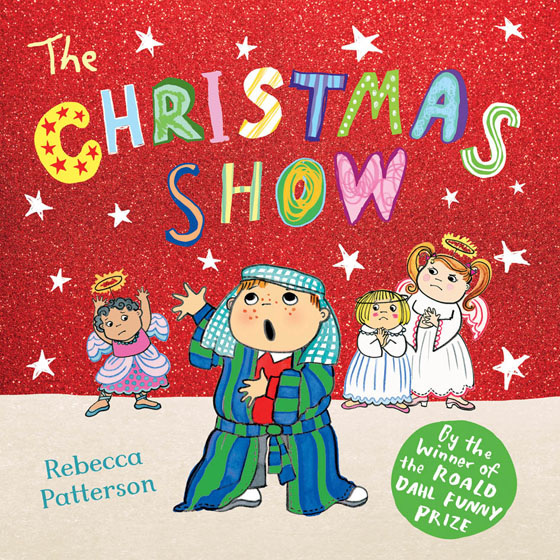
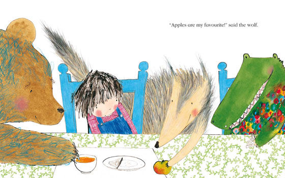
I’ve recently worked on Rebecca Patterson’s newest title ‘The Christmas Show’. It’s such a funny, well-observed book, and you can definitely tell Rebecca has kids of her own! It’s about a spare shepherd who accidentally steals the limelight in the school’s Christmas show, for all the wrong reasons, and the Important Angel who takes it all VERY seriously and isn’t happy with him. We can all relate to these characters and you can see that Rebecca really brings them to life, and makes you feel like you’re in primary school again. She’s already published 3 titles with us, and two books with Random House. For ‘The Christmas Show’ we’ve helped Rebecca to develop her style a bit more, so it’s a bit softer and warmer than her previous books for us which had a more digital feel to the colour. We thought this could help broaden her appeal. We encouraged her to use coloured lines instead of just black outlines, and to add more textures to her work. She did a great job and the artwork looks brilliant!
The cover was so important to get right. As the book’s designer, I’d sketch up ideas and take numerous different versions to our big meetings (which sales, marketing, publicity, rights and all the other departments attend), but they just didn’t feel anything we showed them was quite right. Eventually, after an inspired trip to Paperchase and purchasing a glitter-covered card, the idea of using glitter struck, so now we have a lovely festive-red glittered cover to accompany Rebecca’s adorable characters. And I’m very happy to say although the book isn’t out until the end of September, everyone is very happy with it and it’s already getting a really great reception from everyone who has seen it!
What is the best piece of advice you have ever been offered?
If you want something enough, you have to keep trying. Keep your ears open, be a sponge and learn from others. If you want it enough you will get there. It can be difficult to put yourself in that position where you’re open to rejection, but you have to have a thick skin about it all. Apparently, C.S. Lewis received over 800 rejections before he sold a single piece of writing. You have to listen to feedback from publishers who know the market, and it does help to be responsive. But sometimes when the feedback gets to a certain level (and you start designing a camel!), you have to be true to yourself and only take what is relevant onboard.
Who or what have you been particularly inspired by over the past year?
I’ve been fortunate enough to do a lot of traveling recently, and the whole process is such an inspiring experience. I love just being on transport and absorbing my surrounds (although maybe not the tube!), I find I come up with ideas for projects on planes quite a lot. I think in our everyday lives we’re so focused on our everyday life and to-do lists, it is just so refreshing to take yourself out of that situation and enjoy being somewhere different. I went to Japan a few months back, and it is such an awesome place for creatives. Culturally it is so rich and different, and the Japanese are really innovative and take things to the next level.
How does the experience of art directing an up and coming illustrator (such as Macmillan prize winners) differ from the more established illustrators involved in books such as The Gruffalo or Meg Cabot.
When working with established illustrators such as Axel Scheffler, it means that they’ve really had the time and experience to hone their style, so there’s a confidence there- and we can sometimes just leave them to it. It’s still nice to push boundaries where you can.
When art directing up and coming illustrators, it means, you have the pleasure of helping them to develop their style a bit more.
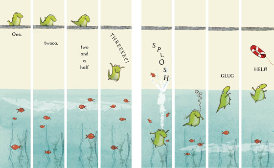
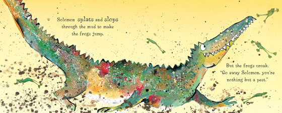
Recently I worked on Gemma Merinos charming debut book ‘The Crocodile Who Didn’t Like Water’. Gemma was the first prize winner at the Macmillan prize in 2011. She has a wonderful, sophisticated style- she illustrates in monoprint, which really brings the characters to life (it creates a wonderful line that really brings integrity into the work), and then adds textures and colours to them. The story shape was all there, but we felt we needed to change the pacing and push the illustrations themselves. A common thing for new illustrators is to use only double page spreads throughout the book, but with the introduction of a few vignettes and single-page illustrations it meant we could fit in more content, get to know the characters a bit more, and change the pacing of the story. Also, whilst I love her sophisticated artwork, we needed to just add a bit more colour into her palette to make it more child-friendly and accessible, without losing her sense of style. Also with the mono print technique, there is a lot of grain so in some places we needed to clean this up a bit, especially when it compromised the expression of the characters (eg- in their eyes). I know we had a few difficulties between Gemma & I in agreeing the right balance, but I think it works well. And though not released yet, it has scored numerous co-editions and admirers. This is one of my favourite spreads in the book.
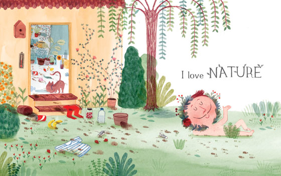
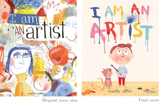
Another new artist who I really enjoy working with is the marvellous Marta Altés. Marta is a hugely talented, lovely artist, whose previous book ‘My Grandpa’ has been released to huge critical acclaim, earning wonderful reviews from top influential figures- including the New York Times. I had the privilege of working on Marta’s book, ‘I Am an Artist,’ which is a hilarious story of a boy who just can’t stop creating art. This was Marta’s second book with Macmillan (she also had a book she worked on at her course, called ‘No’ which was shortlisted for the Waterstones prize.) Marta came to us with this story already written, and so the general structure of this was all there. In terms of illustration, it was a lot more complex then her previous titles as there was so much lovely details in every scene (including a very cool plant installation in the fridge). We worked on the character a bit more, making him child-friendlier. And Marta also works in a lovely watercolour and pencil style… We felt that at times, the watercolour could do with a bit more definition, so would help her with this to bring a bit more form and clarity to her work. She often works with a limited colour palette, and it turns out that Marta hates the colour green. Which, when illustrating a garden in all its natural green beauty, would often become problematic. Gradually we managed to coax her into using a few different greens in there, but it is her least favourite spread in the book! (Sorry Marta!)
With the front cover, she originally had this great arty idea for it, but unfortunately the sales team didn’t feel it was right, and felt having the main character on the cover would help children relate to it. This is the final cover for her book- with cool Alan Fletcher inspired type. I think she’s done a brilliant job in finding the right balance between being child-friendly and also being arty at the same time.
What does your workspace at Macmillan look like?
MESSY!!!!
Talk us through an illustrator’s work which really caught your eye recently and explain why they stood out.
I really love the work of Katherina Manolessou. She has a book coming out from Macmillan called ‘Zoom Zoom Zoom’ and she has the most amazing process, a real labour of love. She draws everything with a brush and black acrylic ink on paper. All the elements of the illustration are scanned in Photoshop where they are arranged in layers, which correspond to the different screenprint colours. She then print these layers in black and white onto her computer printer and transfers them on to screens. Some of the screenprints in the book had up to 12 different printings, the simpler ones had 5 or 6. She works with both transparent and opaque colours so that she can create new colours from overprinting. Simply beautiful.
Which 3 titles from the Macmillan Children’s Books range would you highlight as your personal favourites? What makes the illustrations in these titles so captivating?
Aside from Marta Altés, Gemma Merino & Rebecca Patterson, who I’ve already spoken about, I would say that I really love the work of Rebecca Cobb, and her book ‘Lunchtime.’ She has an amazing spontaneous style with very adorable, warm characters. She does each illustration as one final artwork which is very inspiring to see. I’m always filled with awe when I see each piece.
Catharine Rayner has such a striking style- I love how she really uses each medium and exploits them to their fullest potential. You can tell she’s spent days upon days in zoo’s observing and sketching animals.
Tor Freeman is also a fabulous illustrator. She’s incredible at creating detail and scenes, and her characters really do come to life. She’s also great at interior design (you can tell from the patterns she uses), I’d have her decorate my home. Her new books ‘Showtime for Billie & Coco’ and ‘Toucan Brothers’ are ace and so hilarious too. I can spend hours looking at each scene.
Childrensillustrators.com would like to thank Sharon for providing such a wonderful insight into her daily working life.
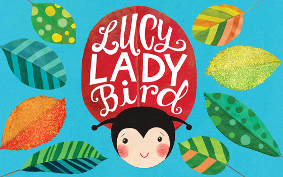
Sharon has her own picture book Lucy Ladybird out now!
You can see the website at Lucyladybird.com or buy at Amazon.com
And to check out her design work, go to Eyeflyhigh.com
This interview has been syndicated courtesy of Childrensillustrators.com