Stripes Publishing was founded in 2006 and has since published a host of successful titles including Lost in the Snow, Fleas! and the Dinkin Dings series. How long have you been Design Manager and what was your professional background prior to joining the company?
I left university with a degree in Illustration for Children’s Publishing and, after a short career as a freelance illustrator, joined Magi Publications’ new novelty book list, Caterpillar Books in 2003. Caterpillar Books has the same strong focus on creatively led, contemporary and innovative packaging that sister company Little Tiger Press is known for, and this really appealed to me. As part of this small and energetic team I found that I grew as a designer with the list. Then, in 2007, I was promoted to the position of Design Manager at Stripes. It seemed a pretty natural step to apply my experience at Caterpillar to the next new imprint, and things grew from there.
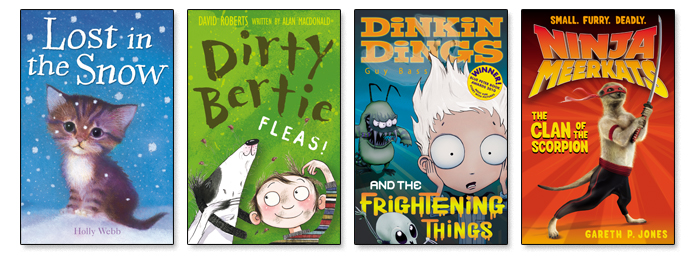
Lost in the Snow – one of our twelve launch titles, and Ninja Meerkats – one of the newest additions to the list.
Stripes Publishing’s aim is to ‘create books that children WANT to read, not because it’s good for them (although that’s a welcome side effect) but because it’s FUN!’ What are some of the essential ingredients involved in achieving this objective from a design perspective?
A very good question – it’s important not to lose sight of your audience! We always try to make our books as exciting and visually stimulating for children as possible, with eye catching cover images and interactive page layouts for the younger end of our market. The cover is critical, and needs to be clearly targeted at the reader with a ‘pick-up-able’ feel.
At the beginning of every new project I try to get to the root of WHAT makes it a fun read. I think that we have to be very clear from the start, what kind of ‘feel’ we want from the book or series. Having previously worked on a novelty book list, I would often find myself asking, does this work? What kind of a brand are we trying to create? Does it feel complete as a package? These questions are just as relevant to a fiction list. Once we agree on the tone, ideas and ‘voice’ of a project we spend quite a bit of time ensuring the entire design is sympathetic to this. Of course, we pay a lot of attention to the cover as it should represent the story as completely as possible, but we also carry our ideas through to all the details – even the page numbers!
Bluebell Woods is a great example of a package feeling ‘complete’. The idea for the series was to bring a fresh look to quite a classic set of animal stories, making them feel contemporary and commercial. The fold out cover and die-cut was a lovely way of drawing the reader into this world, like a window, focussing on each character’s story in that particular book.
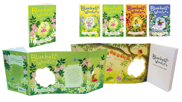
Bluebell Woods. The seasonality of each title gives the series a real collectable feel (and was a great guide for colour palettes for the illustrator).
As Design Manager, you work closely with illustrators. How does this relationship work?
The key to this relationship is communication. The correlation between text and image is integral to achieving the right tone for a story, and with that in mind I like to sit down and talk over the project with the illustrator before they get going on any sketches. Where possible, I think it’s good to meet a new illustrator in person. It helps me as a designer to get to know their background and previous work as well as getting an idea of what motivates them and what they do best. The better you know an illustrator, the easier it is to overcome any problems that might arise going forwards. Naturally, most projects evolve organically throughout the process, and it’s up to the designer to be flexible enough to work around this, keeping the original objectives in mind. That said, it’s important that your objectives are clear at the start, and I’ll always try to find some good points of visual reference as inspiration.
You are responsible for creating design concepts for books aimed at 6 yr olds through to teens. How does the process of putting an early readers book together compare to an older title?
Every project is different, so there’s no formula to apply! Our series for younger children, e.g. Dirty Bertie and Animal Antics, are aimed at children who are developing reading confidence, and with that in mind we have extensive meetings over the typography and its appropriateness for the readership, its legibility and how it will work in relation to the illustration style. As a designer you’ll often have a different or complementary view to your editors on how, what or where an image should be used. This is why it’s important to have these meetings at an early stage.
The books for younger readers are heavy on the illustration budget – I might look to commission roughly 35 to 50 black and white images (and find ways of keeping spreads without commissioned images illustrative and as visually stimulating). In contrast, we might only commission a cover illustration and chapter headers for an older title such as Gravenhunger.
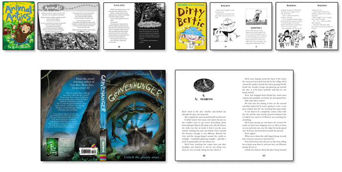
Dirty Bertie and Animal Antics, are aimed at younger readers – their simple, bold layout, short chapters and copious illustrations are ideal for building reading confidence. Gravenhunger is aimed at 9-12-year-old, with a denser text and chapter icons.
Searching for talented new artists must be one of the most rewarding parts of your job. What’s the most original character idea you have ever seen from an illustrator?
I love finding and meeting new illustrators. I also enjoy working with a more experienced illustrator who might be working in a particular age group for the first time, or trying a new style. The concepts we develop in house allow us the freedom to commission some really unique illustration styles, e.g. the cover images for Ninja Meerkats.
One of the most original characters I’ve worked on recently is Stitch Head, who was brought to life by award-winning illustrator Pete Williamson. Guy Bass, the author, had some ideas of how Stitch Head should look, and Pete was able to capture these brilliantly. It was quite a difficult brief, as althoughStitch Head is a Frankeinstein-esque character, it was important he didn’t look too scary for the age group.
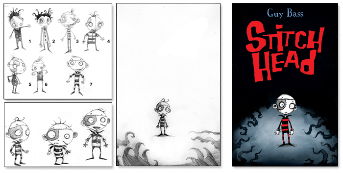
Some of Pete’s early sketches for Stitch Head … and the final cover design!
What projects are you working on right now?
It’s an exciting time at Stripes at the moment – we’ve got some really lovely things in the pipeline! We’ve just acquired our first teen title by debut author Andy Robb. It’s a brilliant read with a great central character, so I’m very excited about what we’re going to do with the cover. We also have a handful of new series that are at the commissioning stage, so I’m taking the opportunity to look for some new talent.
And of course we’re always looking to build our existing authors like Holly Webb and Guy Bass. We’ve recently rebranded the covers for Holly’s series, My Naughty Little Puppy, and I’m currently working on the cover for the sequel to Stitch Head – the first cover had a very strong central image, so it’s important that the second cover is equally as bold!
Stripes Publishing is an imprint of Magi Publication. How much interaction do you have with the parent company or sister imprints?
Magi Publications is one of the biggest independent children’s publishers in the UK, and we have a lot of interaction between the lists, which fosters a really creative and collaborative environment. And, as one of the oldest serving designers for the group, I’m keen to know what the other imprints are up to!
I’m always on the lookout for new illustrators with a unique style, and sometimes colleagues from the other lists point me towards illustrators whose work I might not have seen before. Equally, I may have spotted an illustrator in my research who isn’t quite right for Stripes, but would be perfect for LTP or Caterpillar. It always feels good to home an illustrator, even if it’s not on your list! In fact, some of our illustrators are especially versatile, and are quick and talented enough to work across three lists simultaneously.
Some of the characters on the Stripes list have crossed over from picture books into fiction, namelyDirty Bertie and The Grunt and The Grouch. It’s rewarding to think that the children who enjoyed Dirty Bertie in the picture books can follow his adventures when they start reading independently.
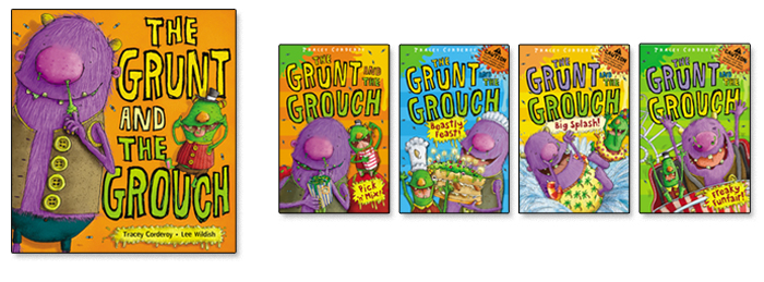
The Grunt and The Grouch picture book and fiction titles, which launched simultaneously across the Little Tiger and Stripes lists
What is your process for coming up with new book ideas?
The majority of our series are developed in house with publisher Jane Harris, the editors and the designers. We have frequent brainstorming sessions to discuss new ideas, and out of every twenty that we come up with only about five make it through each year! Sometimes the ideas are inspired by input from our sales and marketing departments, as a response to current trends. We also commission stories from authors and occasionally get involved in an auction – it’s always wonderful to read an original and fully-formed idea with a really unique voice from an author.
Who do you work most closely with at Stripes Publishing?
I work very closely with the rest of the design team, and as we’re seated in the same room as the editors we have a very collaborative working environment! I also keep an eye on every stage of the book production process, which means a lot of involvement with production, and sales and marketing. Because we’re such a small team we also design all the Stripes marketing material, including the catalogue and AIs and material for the website: www.stripespublishing.co.uk. I think having an intimate knowledge of the books allows us to build a stronger brand for each series.
What or who inspires you within design or illustration?
I draw inspiration from a wide range of sources – everything from Ardizzone, to concept art for Pixar, to movie posters from the 1950s. That said, I always come back to our audience. With them in mind, I’d say you can’t beat a good story for inspiration. An inspiring idea with well-imagined characters never fails to spark off a thousand ideas…
Dirty Bertie, Stripes’ hugely loved trouble magnet and reading ambassador!
This interview has been syndicated courtesy of Childrensillustrators.com