What is your professional background and how did you come to be Art Director at Houghton Mifflin Harcourt?
Here’s how I started with HMH. Five years ago, I was hired as a Senior Designer in children’s books, specifically paperbacks. Two years later, I was promoted to Associate Art Director overseeing paperbacks while also designing young adult jackets. Now, I find myself the Art Director of Franchise and Paperbacks. Before HMH, I was a designer at Random House where I designed in the Creative Services department. Prior to Random House, I was a designer at Pushpin and worked under Seymour Chwast; it was from there I applied for the position at Random House and that became my first job in publishing. I had only worked in studios prior to that.
I knew I wanted to create work with type and image, words and pictures. At every fork in the road, I took the path which eventually led me here. I received a BA in Journalism and reported for a short while. A highlight from my time working as an editorial assistant for People Magazine was interviewing Smokey Robinson, who called me “little miss.” Oh! And Danny Glover, who is very sharp and eloquent. I decided I wanted to go to art school (sorry, mom and dad) and received my master’s in design from Pratt. After Pratt, New York City was my oyster and I landed at Pushpin. This was a non-linear retelling of my path so far… kind of like a choose-your-own-adventure…
Please can you talk us through the creation of one of HMH’s children’s books, highlighting the various stages and people involved, from manuscript through to final publication.
There are different steps in the creation process depending on the format– whether it’s a teen novel, a picture book, a novelty book with moving pieces… The process varies from book to book.
Basically, the editor acquires a manuscript and the design department gets involved when the manuscript is ready for transmittal. For some special format books, some design input is handy from the very beginning. We have a meeting called a transmittal meeting, where the editor, managing editor and art director meet and discuss the book and we review important dates to note and any other concerns regarding the audience or look of the book. After that meeting, the manuscript is assigned to a designer or art director and the book begins to take shape. The interior is story-boarded and a rough layout is created. Some illustrators prefer to work from a galley and I’ll send them one with the text laid out and the page trim marked. Other illustrators, once they’re signed up to illustrate for us, come back with a full dummy of their own. Along the way, cover ideas are presented at a cover meeting. The editor, sales and marketing staff and designer attend the meeting and the cover ideas are presented to everyone. Feed back is given and we either move to final or go back and revise.
Fast forward, when we have a final cover image and the interior has been edited clean and final art is placed (for a picture book), we package the books for the production department. The production department interfaces with the color separators, printers and bindery. We get proofs from our printers for covers, jackets and interior pages. We review color proofs in our color room, comparing the proof with the original art (in the case of digital art, we proof against the illustrator’s color comments — they’re sent a set of proofs to review). There is so much care taken to make sure the final printed book properly convey the author’s and illustrator’s vision. The book belongs to the author and illustrator and it’s a happy duty for me to see that through. Fast forward again to when everything has been approved for color and edits– we have a bound book in (as I’m answering this, I realize I’m glossing over a lot of examples of which fall outside of this particular process).
Tell us about some of Houghton Mifflin Harcourt’s newest releases and explain why you are so proud of them from an art direction perspective.
HMH has a lot of new titles coming out – and each one has been carefully and thoughtfully vetted, starting from the initial manuscript stage. By the time the manuscript arrives on my desk, I know I’m in for a treat. So, from an art direction perspective, it’s satisfying to start fleshing out a few directions for the look of the book with the foundation being a good story. You consider the whole package, the audience, the season, the topic… typefaces, paper stock, cover finishes, trim size, all these things are discussed and reviewed. And now with e-book usage of the content, there are new considerations to add in there,so we design with an eye toward future formatting.
What elements should an illustrator include in their portfolio if they want to specifically appeal to Houghton Mifflin Harcourt?
I’d like to see a strong statement on style and the personality of the illustrator. I sometimes see portfolios which display several different directions – which is great – but if each direction isn’t very finished in feeling, I don’t feel strongly that I this is the right artist for us. Which isn’t to say that your portfolio shouldn’t have a range of subjects or colors or media – it should! The portfolios which get passed around have a distinct voice/vision and we send them around to everyone in the design department. I would rather see a portfolio with a strong point of view which might not be right for a lot of books than a middle-of-the-road functionally competent portfolio which can be forgettable and generic.
Which book has been the most fun to work on during your time at Houghton Mifflin Harcourt so far and why?
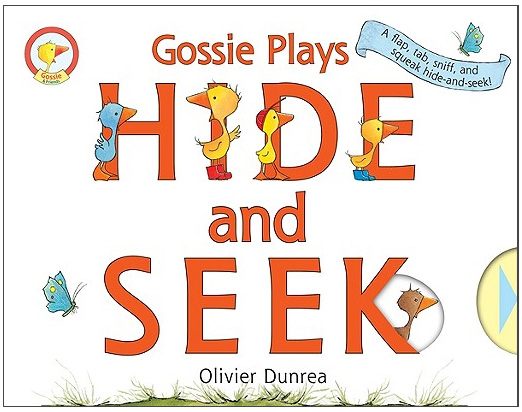
What a question! I will always have several which immediately come to mind, then when I think about it a little more, I remember other goodies… There are jackets I’ve designed which were approved relatively quickly, with all of sales and marketing and editorial on board. Awaken by Katie Kacvinsky,Wuftoom by Mary G. Thompson, The Wrap-Up List by Steven Arntson– with the exception of Wuftoom, I created the art on the cover using stock images and my own illustrations and photography (Awaken has parts of a photo I took of my bathroom ceiling – it was the perfect texture!). For Wuftoom, I commissioned the illustrator Neil Swaab. That’s fun. I’ve also worked on picture books where the back and forth between me and the illustrator became so idiosyncratic, the shorthand we’d use in our emails and the written comments on the materials sent back and forth became some sort of new language. I’ve worked on several novelty books which included stickers, pull tabs, turning wheels, gate-folds, scratch-n-sniff panels. One of my favorites is Gossie Plays Hide-N-Seek, which has all those elements. Those books are as fun to work on as they are to read. I remember going over the textile samples from our printer with the production coordinator, trying to pick the right “fur” for a goat. Was this one too long and curly? Was that one too stringy?
How is the art department at Houghton Mifflin Harcourt structured?
We have a Creative Director, who oversees the Boston group and the New York group. HMH has offices in both Boston and New York. Under her are three art directors, with me being one of them. Under us are three senior designers, five designers, and four junior designers. One designer and one junior designer report to me. Together the three of us tackle the franchise titles and paperbacks, while also handling any young adult novels or non-fictions which come our way.
What gives Houghton Mifflin Harcourt the edge over other publishers when it comes to producing bestselling children’s books?
That we have the quirkiest and coolest designers around? HMH has a great group of really nerdy-in-the-best-way people who are really into what they do for a living and it shows. The designers I work with geek out over type and illustrator’s blogs and mailers. We love children’s books – as a physical object and magical-story-telling-machine. HMH children’s book designers really throw themselves into a book and get the job done. Increasingly, with new formats and new production standards, there’s more and more to be aware of as we design, and that keeps everything fresh and new for us.
Do you prefer working with established illustrators, or are you a champion of new, unpublished talent?
There are pros and cons to either option. I care about meeting deadlines and clear communication between me and the illustrator… there have been experiences with illustrators who disappear for months and miss deadlines and there have been illustrators who’ve gone above and beyond the initial expectations– and it’s a coin toss whether that illustrator was an old pro or a new kid on the block. I prefer working with someone whose QUALITY is consistent. If a story doesn’t resonate with them, I’d rather they turn it down when we approach them than for them to later to force it out. If the scheduling doesn’t work, I’d rather they let me know and maybe we can find a solution. The worst is when the entire book is in jeopardy because of production deadlines being missed or art revisions having some difficulty and no resolution is in sight. So, I’m not sure that I answered this question! I’d say, I prefer working with someone who displays a consistent quality and feeling in their portfolio – and that my first impression of them counts.
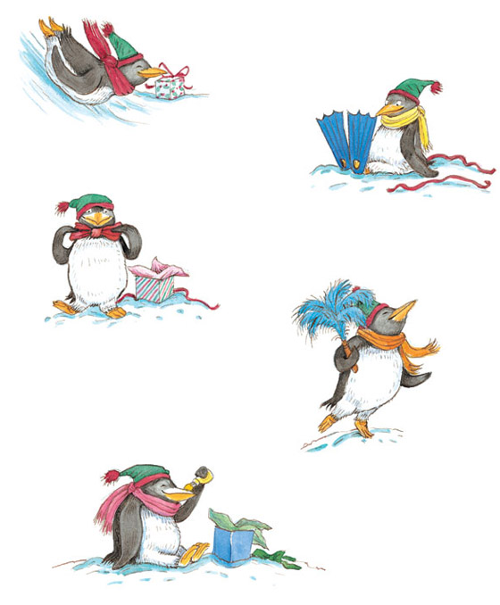
Tacky the Penguin – illustration by Lynn Munsinger
How many projects do you tend to work on at once?
I work on many projects at once! Oh, let’s see… at any given moment, I have around twenty-five to thirty active titles, titles which are in various stages of production. I could be working up sketches for a jacket and running out galleys for a picture book, setting interior samples for layout in a novel, reviewing outtakes from a photo shoot for a young adult novel cover, selecting a new model from a collection of head shots for the aforementioned photo shoot, color correcting art files to send to the printer, making color comments on printed proofs from the printer… and then there’s choosing the right “fur” for a touch-n-feel book!
Houghton Mifflin Harcourt publishes books for children aged 0 through to teens. What are some of the thrills and challenges associated with art directing such a broad range of children’s books?
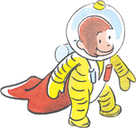
I could be working on a Curious George activity book or a coming of age novel for teens. In each instance, I am creating or directing the visuals to advertise the story within or add to the experience of the story. Books tell stories which unfold, page by page… a beginning, middle and end live between the covers, but the most beginning-est of beginnings lives on the book cover itself and it’s my goal to let you know, with words and pictures, what lies within, and encourage you to pick it up and possibly fall in love. If you don’t fall in love, no worries, there are worst things than reading a book!
Here is a quote I have pinned up above my monitor:
“There is nothing more satisfying than the object that is a book.”– Paula Scher
This interview has been syndicated courtesy of Childrensillustrators.com


