Tell us what kick started your career in the creative field.
Quite simply: my mother. She’s a fine artist and illustrator. When I was growing up, our house was filled with her oil paintings and sculptures. I can’t count how many times I wanted to shower, but there was watercolor paper in the bathtub stretching for her latest children’s book. I wanted to be like her, so against her wishes (that I never sell my soul and get into advertising), in 1994, I got a job as a junior designer.
What have been some of the biggest highlights (and low points) so far?
I guess the first would be was when I moved from New Zealand to Australia, completed AWARD School (portfolio school) in the top 10, and then being excepted as an art director into Saatchi & Saatchi Sydney’s creative department. It was a long time ago, but it’s something I’ll never forget. I think that’s something all creatives cherish forever – their first gig.
Another highlight worth mentioning is simply being lucky enough to have worked with some of the smartest minds in advertising. The amount of stuff this sponge in my skull has gleaned from all those legends is the only reason I’m successful; honestly. If there was any advice I’d impart to junior creatives is harass the old guard . . . buying them a beer can help.
My only low points sit quietly in my bottom drawer, poised and ready for the clients with balls.
How do you describe yourself as a creative and the kind of work you do?
I like to think that the “senior” in my title is a reflection of who I am creatively, however, in all honesty, I’m still a novice. The advertising landscape is forever evolving, and sometimes more rapidly than this beer-soaked brain of mine can keep up. I guess that translates into the kind of work I do: forever evolving.
That said, a few things remain constant in my thinking. Therefore, I’ll start by saying that I dislike it when brands bombard consumers with chest-beating propaganda about how great their product or service is. If you’re going to interrupt my TV, driving or internet experience then do it with humility and intrigue. Express an opinion in an interesting way that reflects your brand, and, if I agree, I’ll remember you . . . or follow you, as the cool kids say. For example, when a brief for a Vegas casino fell into our laps, instead of showing the casino floor, the wonderful suites or people winning, we communicated the attitude of the resort and the people who might frequent there. The spot doesn’t look anything like a casino commercial or a commercial at all, for that matter. The consumer knows there will be a bed, they know there’s a casino, but what they don’t know is, what’s the vibe?
How is creativity rewarded and celebrated at Fallon?
Creativity is a team effort at Fallon, so we have initiatives that everyone can participate in no matter what your job description. One initiative worth mentioning is Dream Catchers. With each paycheck we sacrifice a small amount of cash, and, after three years, Fallon will double the amount you saved with two weeks off to realize your dream. I think that’s pretty darn cool.
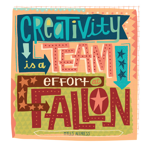
Lettering by Jill Howarth, represented by Good Illustration
Which other creative minds have you most enjoyed collaborating with? [please provide anecdotal examples from past projects]
There are so many. One would be very early on in my career, I worked alongside Pete Buckley and Tim Brown at Saatchi & Saatchi Sydney. They were hugely influential on me early on. Anyway, my partner and I had a spec idea for the Pedestrian Council to air on St Patrick’s Day. I was drawing the slides, when Pete peered at it over my shoulder. He got it instantly and said, “F**K the Pedestrian Council, we’ll sell it into Toyota.” Which they did. Within four weeks, my first TV spot was on air.
Another hugely influential team on me was Vince Lagana and Steve Jackson. There was a Toyota brief floating around that nobody wanted because there wasn’t much money attached to it, and it was merely written to satisfy the truck dealers in rural Australia. Vince and Steve cared not, and wrote one of the greatest campaigns I’ve ever seen – Toyota, Nothing Soft Gets In. It went on to win five gold lions at Cannes as well as metal at every other award show out there. The lesson there is that there’s an opportunity in every single brief that lands on your desk no matter how small the budget.
Lastly, I’ve worked with some great writers in my time, but none more greater than my current partner Simon Roseblade. He’s truly a writer that, I think, all young writers should aspire to be. After 20 years, it starts to get difficult to get out of bed, but the fact I know I get to work with Simon makes it a hell-of-a-lot easier.
Select 3 killer projects from your portfolio of work to share with our audience.
I hate these questions, because the best is yet to come. However, the first is the casino ad I was talking about earlier, so I don’t need to explain any further. And 3.2 million views on YouTube isn’t bad either.
Second is a TV and print campaign for Toyota Rav 4. The client blessed us with carte blanche, which doesn’t happen often. They’re probably a little dated and silly, but they still make me giggle.
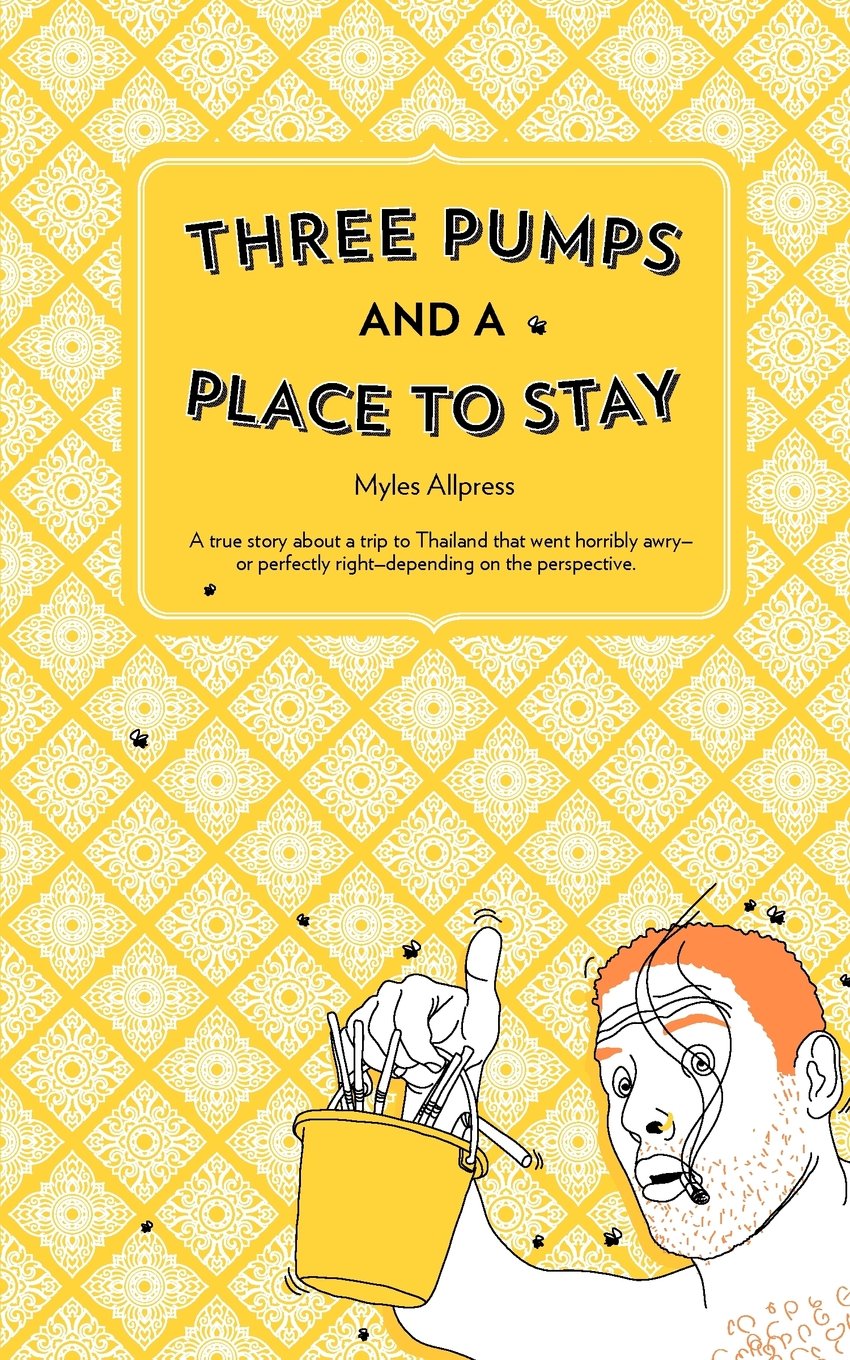
Lastly isn’t advertising, but this is a novella I wrote in 2012. I’m pretty chuffed with it mainly because I’m an art director and not a writer, however, writing is something I’d like to continue to get better at.
Give a few examples of great art direction – past or present.
I feel rather awkward about posting other peoples work, so I would prefer to list a few art directors who I’ve admired over the years. Any aspiring AD should really search out and study these people, because anything produced by them will be examples of great art direction. In no particular order:
Dave Dye (Mother London), Paul Belford (This is Real Art, UK), Richard Flintham (101, UK), Melanie Forster (Freelance UK/US), Basil Christensen (Retired, NZ), Peter Buckley (Disciple, AUS), Vince Lagana (Leo Burnett, AUS) and Jeff Williams (Wieden + Kennedy Portland, US).
What frustrates you about the creative process?
I’m not sure if this is specifically the creative process, but 4:3 aspect ratio. It drives me insane. I was told back in the mid 00s that we wouldn’t have to shoot or set anything inside 4:3 safe by 2010. Well, it’s now 2014 and the networks still make us adhere to those antiquated rules. So much money, time and anguish would be saved if we just let it go already.
How do you keep your skills and knowledge up to date?
I don’t know. I suppose, I remember to love what I do. That, in turn, keeps me interested enough to watch, read and glean information. The moment you become too cynical and start hating on the industry, you’ll stop learning.
In your view, what’s been the most a) epic and b) flawed ad campaign of recent times?
That’s a very hard question to answer, but I’d have to say Wieden + Kennedy London’s The Power of Dreams campaign for Honda. Over the last 10 years that campaign has produced some of the most awe inspiring work ever. Cog, Grrr, The Impossible Dream just to name a few, but the list goes on.
I won’t call out the most flawed. I believe this job is difficult enough without someone calling out your work’s flaws. We, as creatives, come up against things that are detrimental to our work, and compromises our creative daily. It’s the harsh reality of our business – sometimes shit just doesn’t work out.


