Childrensillustrators.com caught up with Mike Jolley at the 2010 London Book Fair.
Take us through your background including how you came to work for Templar Publishing.
My background IS Templar Publishing! The Art Director at the time came to my end of year show at Reigate Art School (sadly no longer), and after a couple of amusing interviews, I was offered a job as junior designer.
I have worked for Templar, on and off, for 25 years. I have moved on two occasions, once to work for Salamander Books (also no longer – nothing to do with me, I hope), and then to spend three years in Amsterdam working in a design group associated with the J. Walter Thompson advertising agency. It was a crazy job, but a great experience, at least in hindsight.
During that time I kept in touch with Amanda Wood, and Templar, and did various freelance book projects whilst there. I think I always knew I would be back on the island, and back at templar, at some point.
I have been the Art Director here for about 10 years. I have recently gone part time, to hopefully free up some time and brain space for other interesting projects.
How does the creative department at Templar Publishing typically collaborate on projects?
We have a permanent team of designers and editors of around 15, with regular freelance and part-time contributors too. Each project is assigned an editor and a designer, who work as a team. The teams are mixed up so most people get to work with each other. In this current office all of the designers and editors are in the same space, which helps communication and sharing of ideas.
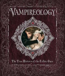
Vampires are hot property right now. Tell us a little about your recent Ology title, “Vampirology”.
What can I say? It’s an Ology title, and it’s about vampires! It follows the formula of previous titles in the series, in that it has an editorial conceit and, in this case, two separate narratives running through the book. Ngheim Ta, our brilliant designer, has blended Victorian gothic with Art & Crafts/pre raphaelite influences, to create the ‘look’ of the book. This then informs her choice of illustration styles and fonts etc. There are three or four different illustrators worked on the book, which again is part of the Ology approach.
This series has been a great opportunity for us to work with a range of illustrators we admire, but had not had the chance to work with before.
The Ology series has been enormously successful for Templar. Could you explain how the subject matters are selected.
Initially the subject matters, and titles, are decided in-house by Amanda Wood, who then works to convince all of the co-edition partners that the ideas will work for them too. Some of the subjects tie in to the curriculum, whilst others capture the zeitgeist, hence Vampires.
To date, what is Templar’s best-selling title and what factors contributed to this success?
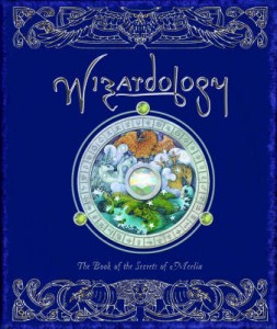
The Ology series are our most commercially successful series. The first title, Dragonology, tapped into the growing fascination in all things fantastical. Also, at the time, there was nothing else quite like it on the market for children. I think the interactive physicality of the book, and its cover played a huge part in its appeal. The book is seen as a precious be-jewelled object. It was bought as much by adults for adults, as for children. They have sold over 16 million copies worldwide. We have a great PR team too, who really went to town on these.
The Sam Lloyd puppet titles have also sold amazingly well. Boris in particular. They are so immediate and Sam’s slightly anarchic sense of humour is such great fun. Who could resist a book with a furry orange monster attached to it.
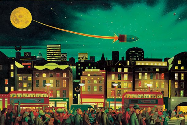
Our best selling picture book is Simon Bartram’s ‘Man on the Moon (a day in the life of Bob)’. It is still reprinting in soft-back, and Bob has gone on to have further adventures. The genius of Simon’s books, for me at least, is the interplay between a very funny ‘matter-of-fact’ text, with the most extraordinarily detailed and sophisticated artwork. He is the most amazing painter/illustrator. Simon has also put a lot into promotion of the book, doing festivals and school events etc, and that has really helped to build a fan base for the Bob character. He is very good at it too. It’s like watching stand up! – very funny.
Initially the subject matters, and titles, are decided in-house by Amanda Wood, who then works to convince all of the co-edition partners that the ideas will work for them too. Some of the subjects tie in to the curriculum, whilst others capture the zeitgeist, hence Vampires.
Childrensillustrators.com sponsor The London Book Fair. What do industry events such as this mean for you?
For Templar they are hugely important. A lot of our business is in co-edition sales, and the fairs are the best places to see a lot of people in one place. We attend all the main book fairs, brand licensing, gift fair etc – even the baby show! For me, they are interesting to see what is going on, and to meet illustrators and their agents.
The London Book Fair’s new Illustrator’s Corner in association with childrensillustrators.com is a great addition – its fantastic to see this new area of the fair championing illustrators.
Describe a recent project which you particularly enjoyed working on.
Can I mention a couple, for different reasons?
Firstly, the picture book, Varmints, by Helen Ward and Marc Craste. This was a dream job, and became a very personal mission to see it realised. Helen and Marc are very original talents, and they have created a stunning book. It is the book I am most proud of playing a small part in.
The other is a recent project called Storyworld, which is less of a book, and more a pack of illustrated storytelling cards. This has been enjoyable because, again, it has allowed me to work with many illustrators I have admired for years, like Peter Malone and Matilda Harrison, and I have also been able to bring in exciting new talents like Levi Pinfold and Daniel Barry.
There are now over 200 pieces commissioned from 20 different illustors, and there will be an exhibition of selected artworks at the Illustration Cupboard in September this year.
What makes an illustrator’s work stand out for you? Please give an example of an illustrator you have worked with.
I think Templar are known for using unique and idiosyncratic artists, and so I am always looking for that something special/different. I like styles that are instantly recognisable. I also look for good, solid draughtsmanship, and
a high degree of technical skill. The artwork has to have some ‘style’ too, if that makes sense.
So many to mention, I’m spoilt for choice, but I guess my personal ‘standout’ would be Simon Bartram. There is no-one else out there quite like him, and he is certainly the most technically accomplished illustrator (painter) I know. As I mentioned before, watch out for Levi Pinfold – amazing talent. He’s thinking of painting his next book in gesso – on wood! I haven’t told the pre-press department yet.
Other personal favourites are Wayne Anderson, Peter Cross and Alan Aldridge (I am a child of the 70s after all) Love all that crazy detail. Grahame Baker-Smith’s digital work is something else too. He really blurs the edges between traditional media and digital.
What can we expect from Templar over the coming months?
We have recently launched a fiction list, which is a new thing for us. I am hoping this will also lead to interesting illustration possibilities. We have a retro-cool Alphabet coming next year from illustrator Paul Thurlby, which is very exciting, and quite different for us.
We are also working on a huge range of titles for the ‘Animal Planet’ brand, a new toddler range, some amazing new pop-up titles with sound-chips, and stylish picture books by new talents Owen Davey and Colin Stimpson.
What 3 pieces of advice would you give childrensillustrators.com members reading this interview?
Advice? Cripes.
1 – Make submissions of art samples and ideas memorable and to the point. You’d be amazed at how many tattered old photocopies I get sent. It sounds awful to say, but keep email intros short and let your images do the talking, at least at first.
2 – If you want an agent, have an agent, if you don’t, then don’t.
3 – Stick to your guns. Do the work you believe in.
This interview has been syndicated courtesy of Childrensillustrators.com


