
How did you arrive at your current position of Art Director at one of the world’s largest independent publishing companies, Candlewick Press, and what was your career path before that?
Stalking. No, really! I had traveled to New England from California for a wedding and knew that Candlewick was in Cambridge, MA (we are now just a few blocks away in Somerville, MA) from admiring their books at industry shows. I showed up on the doorstep and was granted an informational interview with the Human Resources Director. Knowing I wanted to eventually return to the east coast to be nearer to family and friends, I kept a pretty close eye on the positions available after that first visit. About a year later, in 2004, I applied to and then accepted a position to manage the art department and develop the look of their early reader books (what we call 6x9s internally or Candlewick Sparks in paperback). Previously I was a Senior Designer at Chronicle Books, a Designer at Workman publishing, and a Junior (Adult Jackets) Designer at St. Martin’s Press. I briefly worked in magazine design and in art museums including a fellowship at the Peppy Guggenheim Museum in Venice. All experiences eventually led me to focus on working with illustrators – which makes perfect sense for a communications design / art history major.
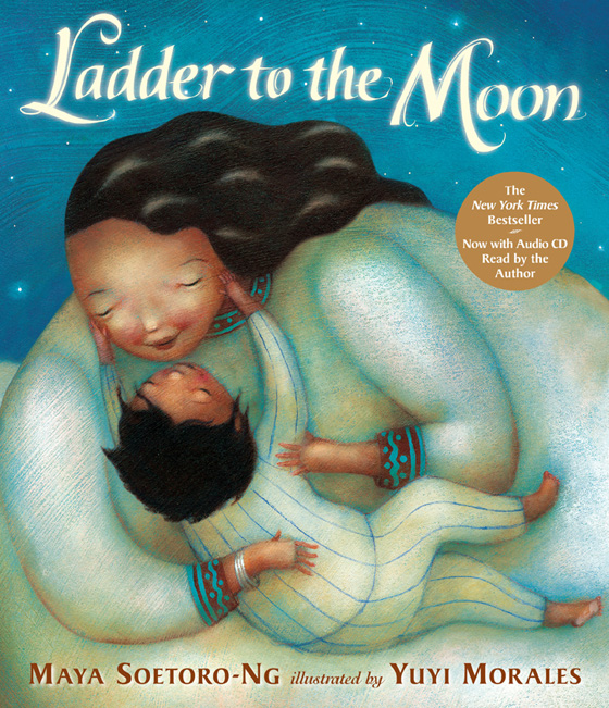
Candlewick’s list of bestselling children’s books is remarkable, including I Want My Hat Back; A Visitor for Bear; Guess How Much I Love You; Ladder to the Moon; My Very First Mother Goose; and It’s Perfectly Normal. How would you describe Candlewick’s ‘personality’ in terms of the type of children’s books the company publishes?
Schizophrenic? Even the list you mention above ranges from simple edgy humor to classically sweet to a fantastical tale of humanity to nonfiction with clarity. I don’t think we have a personality so much as we strive for very high quality on each and every individual book. Our decision making is driven by appropriateness to each unique story – from the illustrator choice to the font and paper stock. As far as fictional picture books I would generally say that we look for unique characters with strong voices and narratives – both in the text and the art. However, for every generalization there is an exception.
How many books does Candlewick publish per year?
Approximately 225-250 (not counting paperbacks and reuse!)
Tell us about Candlewick’s relationship with its parent company, Walker Books, and the partnership with British publisher, Templar.
We work very closely with our colleagues at Walker UK and Walker Australia and together we strive to publish projects globally. That said, the markets can be very different from one another. If, for example, we believe a text will work well in the UK or Australia market then we make sure the illustrator we choose works well there too. Additionally, we create books that are foreign rights friendly and share early sketch stages with the Foreign Rights team to make there isn’t anything overtly American in the art if it isn’t necessary to the story.
Our partnership with Templar has changed from when I first arrived at Candlewick. Our relationship used to be project buy-in based and I was the art director offering feedback on the successful ‘Ology series. Today, Templar is formally an imprint of Candlewick in the US and we publish books beyond the ‘Ology series with them.
Both Walker originated covers and Templar originated covers – and Nosy Crow covers too, another UK based imprint – come to our weekly covers meeting. This is our opportunity to discuss how the book will work in the US market via the front cover art and typography.
Describe a project you have worked on recently, taking us through the key stages.
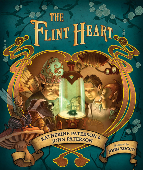
Ladder to the Moon, mentioned above, was a fabulous book to work on. However, more recently I designed and art directed The Flint Heart by Katherine and John Patterson, and illustrated by John Rocco. It is a middle grade fantasy freely abridged from Eden Phillpotts original 1910 version with characters ranging from humans to fairies to talking animals and even a talking water bottle! After several discussions with the editor, we came across some promotional pieces for John Rocco’s Fu Finds the way and, with further research, his Percy Jackson series jackets. When Katherine and John agreed he was the man for the job I designed pages and estimated an art count. John was enthusiastic from the start, thrilled by the challenge of so many characters and the historical relevance of the book. He provided a list of possible illustrations that he would be excited about creating. We discussed these editorially for content and logistically for pacing. Meanwhile John was researching steampunk and art nouveau aesthetics to inform the three worlds he was creating – the human world, the animal world, and the fairy world. We discussed palettes for each world and looked at early character sketches. We worked closely to develop a framing device for chapter openers and debated how to render them differently from the main scenes. John created over 60 exquisitely luminous illustrations, working digitally to colorize after scanning in approved pencil sketches. We carried the interior aesthetics on to the jacket, tweaking the design many times before getting it just right. Finally, inspired by classic books, we stamped artwork onto the spine and cloth-like case as a final design touch.
Who has been your greatest mentor in the world of children’s publishing to date and what pearls of wisdom have they imparted?
I am spoiled with several such people in my life. Kristine Brogno, the Design Director of the Children’s Department at Chronicle Books, was the first to teach me the finer points of working with illustrators in the role of visual editor. She taught me the importance of page turns, the consideration of composition as well as perspective, and the craft of a writing a persuasive art directional letter. She also taught me a lot about having a vision and being able to back up that vision with reason. She is a master of diplomacy and fosters the warmest work environment.
At Candlewick, I am mentored by Creative Director Chris Paul and honored to work beside Art Director Ann Stott. Chris has instilled in me her nuanced affection for typography and the ability to work on a project with gravitas. Ann masterfully churns out classics even when she is reinventing the look of a format or challenging the accepted style. We all share opinions on manuscripts and illustrators – insight that is priceless to seeing different perspectives and approaches.
After reading a manuscript, do you instantly have a sense of the illustration style which would bring it to life?
I do, though it’s not necessarily a style but rather a quality. Generally I write down three or so adjectives when reading a manuscript and I’m looking for those same qualities in the artist’s work.
As a child, which children’s book did you treasure and why?
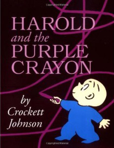
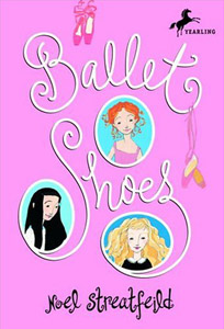
I can truly say I treasured all books. I was always reading much to the frustration of my brother who wanted me to play games with him. My grandmother, a librarian, and my mother, an elementary teacher, were excellent at feeding my passion for reading. However, I don’t remember many picture books or illustrators from my childhood. I loved Harold and the Purple Crayon by Crockett Johnson for it’s adventure and singular color. Later, the Nancy Drew mysteries as well as the ‘Shoes’ series by Noel Streatfeild were favorites. I wanted to be a writer and loved the continued plots and familiar characters of a series.
What general advice would you give an illustrator looking to improve their children’s portfolio – what should they include/not include?
First and foremost unique characters with a variety of emotions – children, adults, animals. Some example of environment, either indoor or outdoor. Unusual perspectives. A range of color samples and palettes and black and white work. Give yourself an assignment each day and share it with others. These days blogs (such as those featured on Childrensillustrators.com) are a wonderful way for art directors to get a sense of an illustrators range, working style, and personality. Most importantly, imbue your work with what drives you – illuminate your passions. Don’t draw a preconceived notion of what you think children’s book art looks like.
What are Candlewick’s key focus areas for 2012 and beyond?
2012 is Candlewick’s 20th birthday so we are celebrating! Specifically, we are celebrating the picture book this year. We still believe in this format and disagree with the negative discussions of it being replaced by chapter books, graphic novels, or ebooks. Beyond 2012 we will continue to focus on publishing only those books we believe in, only those books that speak to children, and only those that have both words and art of the highest quality, as always.
This interview has been syndicated courtesy of Childrensillustrators.com